Friday, December 24, 2010

Christmas Card 2010


This is, of course, my Christmas card this year and not a real book in this form. I borrowed a recent cover I did for Baen Books for this faux beat up copy of a thriller. The real book this cover is for is Grantville Gazette VI and it is a collection of stories around Eric Flint's 1633 series. Click here to learn about this very successful and very well done long-running series. Below is the inside of the card. The physical card is going out late for anyone expecting one.

Monday, December 06, 2010

Several Inks & A Pencil

I have a bunch of pen & ink illustrations to do. To warm up for them I do little inkings. I really love the immediacy of the Pigma pens. You pick one up and you’re inking away. All of these pictures are small, doodles really (except the one above). The point is to get myself relaxed. Ink goes down and stays down. Paint isn’t harsh and unforgiving: make a mistake, wipe it away, do it over. A brush, works for me like a shock absorber, softening the unfortunate shake in my hand. So watch me ruin a couple of these. The one above is an illustration for a book by Orson Scott Card titled Hamlet’s Father. It’s not a test but a finish illustration included so I could have a picture at the top. It was done with Black Magic ink using a #1 W&N sable brush.
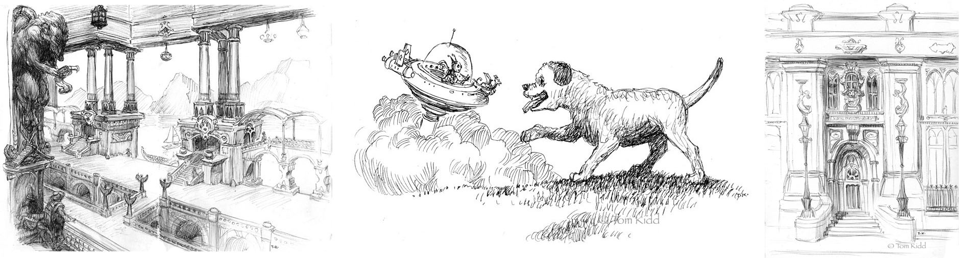
Above: These first three were taken from my transmogrifying sketchbook. I kind of draw from life and change it to something a little or a lot different. Most of these are drawn lightly with pencil and drawn over with a ballpoint pen. Starting at left is a balcony I was sitting on. I changed it quite a bit, mainly using the perspective. It’s both Pigma pen and ballpoint. Next is a doggy I saw running around. In this case I did a few drawings of the puppy separately and redrew it in the scene above. It’s pretty corny but sometimes I want simple, corny and cute. I need to learn how to draw dogs better from memory so this was a useful exercise. I used a Pigma pen on this one. The last one is a bank in town. I fancied it up some. It’s ballpoint.
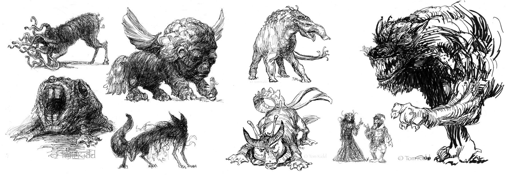
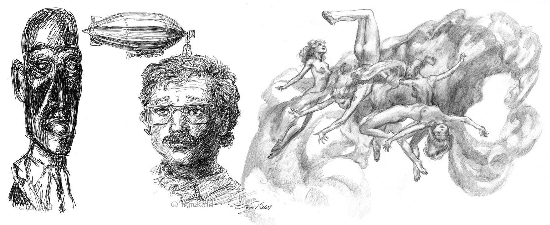
I call the things above id creatures. They’re all over the place it you look carefully, in marble, in stained carpets and in lichen. All were all done with Pigma pens or brushes of one kind or another. The Pigma brushes don’t have the control of a sable dipped in ink but they’re useful when putting down heavy blacks and they don’t cause horrible spills. Some of these were done directly in ink without drawing. Often I get story ideas from these doodles.
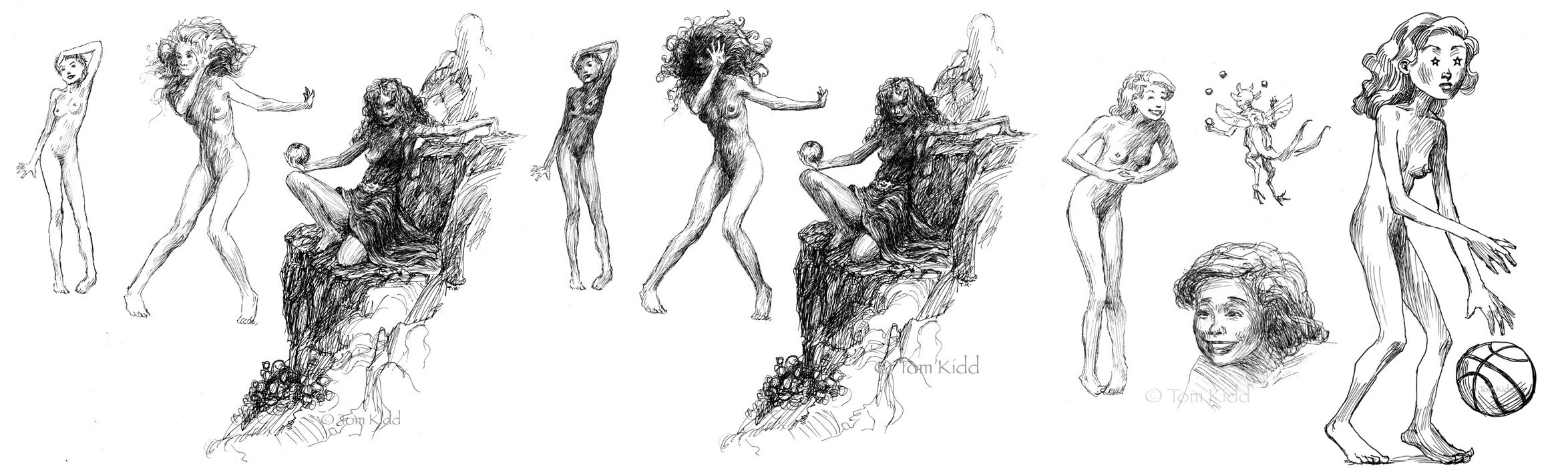
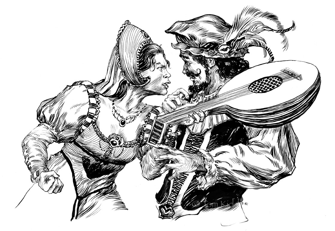
Above: These first two sets are an exercise I call ‘keep inking till you ruin it.’ First I inked the three figures till I was satisfied, scanned the group and inked more. How better to know when you should’ve stopped than to go too far? The girl with her hand on her head is a mess in the second version but the girl holding her hand up still looks okay. I like how the hand stands out now. The mountain girl still looks okay too. It’s a matter of taste on this one. The story behind The Mountain Girl is that she’s a wild feral creature. What’s with the dress, you may ask? She “found” it, tried it on, liked it and is hoping to gain some sophistication by wearing it. Next is the fairy juggler who has charmed the clothes off of the lady he’s entertaining. I often do better with facial expressions when I draw small so after I got the big smile down right I felt I should try it up larger. My wife saw the basketball player with the stars in her eyes and said, hey, her arms are too long. Wrong! Her torso’s too short . . . and her legs a bit. Not to mention the massive hands, feet and head. Cartoons don’t care about their proportions and if they don’t why should I?
Above: As ugly as my friends think it is I love my World Fantasy Award. It was cast from a sculpture by Gahan Wilson after all. You can’t beat that thousand-mile stare from H.P. Lovecraft. I’ve done a couple of drawings of this and I’ll probably do a few more. The light on the slivery bust fascinates me as well. I did this directly in ink with a Pigma pen. I consider the self-portrait a failure. It’s not me. I look too friendly. There’s no hint of the bitter old man I’ve become. Also, my eyes should be a bit more crossed as I look at the mooring airship. People ask me sometimes if I have airships on my mind all the time. Nope, just look to the right of me. There are the flying naked ladies that haunt me with their terrible beauty and their lighter-than-air frolicking. I never quite finished this drawing before the wind caught it one day and it flew away, only to be found damaged under a couch. Now those lofty ladies will have to be kept here constantly nagging me to lighten my mood.

Wednesday, December 01, 2010

Agatha H. and the Airship City, A Navel History

Above are a couple of quick character sketches of Agatha Heterodyne. She’s the main character in Girl Genius. Agatha's normal dress is modest but not always. I figured less was best for the cover.

Okay, I admit it I love airships (the picture above was for another book with airships). Give me a book with airships in it and I’m a happy guy. To tell you the truth it’s not that I like gas filled balloons so much it’s that I’ve done the research and I love putting my knowledge to use. Having read a great deal about airships I know that in our present time we underestimate and underutilize this wonderful technology. We seem blind to its potential. As I write this I shake my head in disappointment for us all. It’s shameful.
Now that I’ve finished proselytizing I can get to the main thing I’m posting about today. I did the cover to a very well written and entertaining book by Phil and Kaja Foglio. The title is Agatha H. and the Airship City. Above is that cover. It’s likely that you’re familiar with the graphic novel that the book is based on but if not go here.
Now to the story of the cover: the art director for Night Shade Books, David Palumbo, contacted me and asked me if I’d like to do the cover. First, the airships – all right! Next, the first book in the series by the Foglios – good deal! I know Phil and Kaja so the pleasure was all mine. It was a mystery to me that Phil wasn’t doing his own cover but that they’d trust me to do it made me feel pretty good. Above is the first stage of painting.
Phil invented some pretty cool machinery and mechanical men so I wanted them to be on the cover. It also had to be an action cover. Agatha had to be there and she had to be beautiful. I figured she should be sexy too. Hey, look at the comic, va-va-va-voom! Above is the next day of painting. As you can see things move fast but then they slow down quick because it took me several days to get to the finish. Note that I move the Wulfenbach troopers, the mechanical men, in closer. Agatha is the center of interest of course.
Above is the cover I first turned in. Here Agatha is dressed in her bedclothes with a coat around her. She makes clockwork men in her sleep and when awoken she is embarrassed to be found dressed skimpily.
The book is being directed at a general audience, and I believe very much that it will have a wide appeal. This is why I was asked to tone down the cover. My friend Photoshop allowed me to make this change without painting on the original. Although, sadly we've lost Agatha's midriff.
Here in this closeup you can see Agatha's well formed belly, bellybutton and all. This is why my subtitle is "A Navel History." It went away only digitally. Thanks to Photoshop what's gone doesn't have to stay gone. It's almost as if the cat's tail points to it.

PS: By the way, art director at Night Shade is David Palumbo, a fantastic artist himself. Here’s something I didn’t know about David until after I did the cover, he’s Julie Bell’s son (I feel stupid having not known this). I only knew he was a good artist. You probably already know this but Julie Bell is married to Boris Vallejo. Boris’ son is Dorian Vallejo whose work always amazes me. That’s not enough though, Julie has another son, Anthony Palumbo, and he’s an accomplished painter as well. Let’s just call them the fantastic five. The reason I think I don’t know much about other artists’ personal lives is because I’m a paint person and not a people person. I tend to be absorbed in the art and I forget to have curiosity about the artists I know.