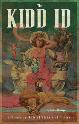
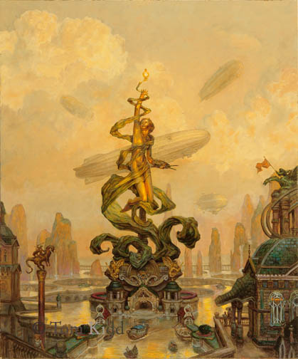
Just for fun, here is another cover that was done with a very different concept for my book in mind. They rejected everything about this.
Yesterday I changed the painting. I’d been planning to for some time because of a trip to Montreal. There I saw a gold statue in the warm morning light. Looking at it I said, wow, that’s how it’s done. I could see how the gold picked up more of the ambient light from the sky than I’d expected and how much more orange the reflected light into shadow was than I’d thought it would be. At the time I originally did the painting that level of color contrast seemed garish but when I compared the painting to the photograph I took of gold statue at the right time of day I felt I had to make a change. Here’s a close-up of that with a before close-up. It’s not quite there yet; maybe I made a mistake; I hope that I learned something. Take my word for it, the original looks better than this little jepg.
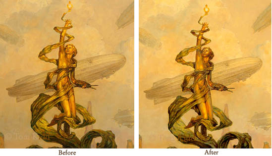
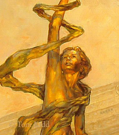
Here’s another even closer shot of it to compare.
I also changed the entire painting in other little ways but probably nothing you can see here.
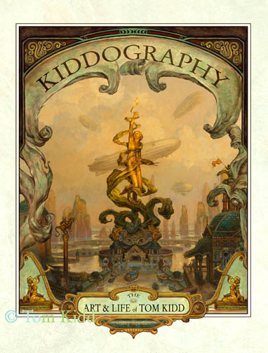
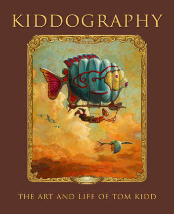
By the way, this is what the cover to Kiddography really looks like.
The next painting I put up that I’ve changed will be quite a bit different from the first version. Here I was just testing a principle, perhaps at the expense of a painting.
Gee I wonder how many hours of paid brainstorming and time-wasting it took them to come up with that idea. Reducing the image and typing the title on top and the author on the bottom. Anyways I think your cover painting rocks and all you can do iis make a rocking cover painting and hope the editor decides to use it, right?
ReplyDeleteP.S. I really admire your approach to picturemaking and if you would look at some of the paintings on my blog I would be honored beyond description. Cheers! -K. klumsyk.blogspot.com
Konstantin,
ReplyDeleteIn the end I was satisfied with the cover. My friends said it reflected my personality just fine. As an illustrator I can see the art director's point of view more often than not. Sometimes I get some bad art direction that ends up reflecting poorly on me. It can be frustrating to hear someone complain about something in a picture that I was specifically told to do and I'd advised against. An illustrator's power of persuasion my be his or her most important ability.