Cover to How-To Book Becomes How-To
Above is not the cover to the book with this title unless you're from an alternate world. In our world it's the cover to Starfinder, a nicely written book by John Marco.
I was planning to write this as a detailed explanation of how I work but I changed my mind and I decided to leave it open to question. If you want to know how the paint was applied, what paint I used, what mediums went into this or if there’s anything you wonder about ask me and I’ll answer. It’s likely that there’s a lot of things I don’t know I know and won’t till someone asks me.
I was planning to write this as a detailed explanation of how I work but I changed my mind and I decided to leave it open to question. If you want to know how the paint was applied, what paint I used, what mediums went into this or if there’s anything you wonder about ask me and I’ll answer. It’s likely that there’s a lot of things I don’t know I know and won’t till someone asks me.
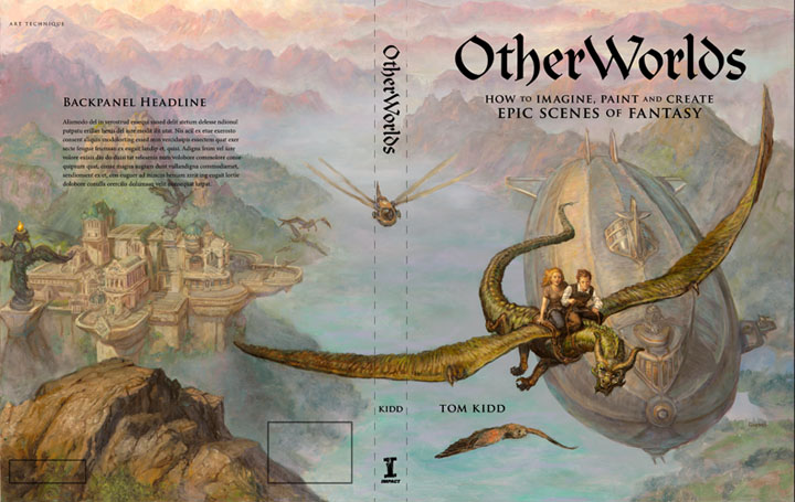
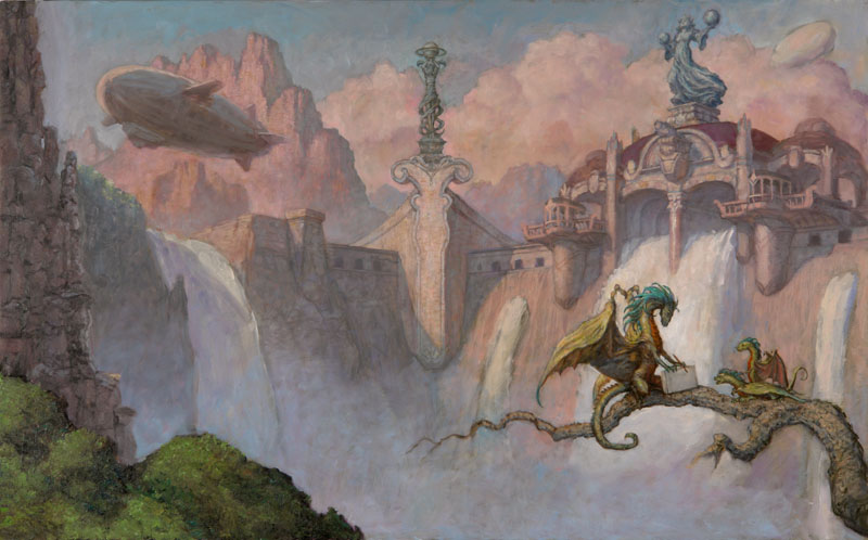
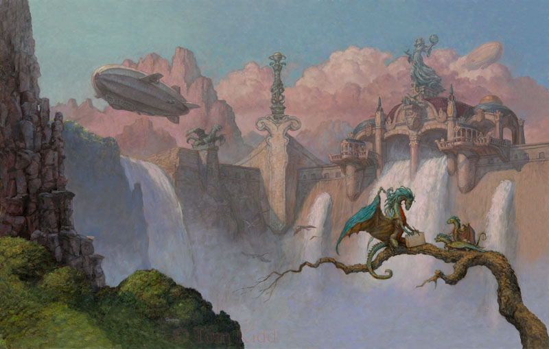
This is a step-by-step for the cover I did for OtherWorlds: How to Imagine, Paint and Create Epic Scenes of Fantasy. That sure is a long title. I have to look it up every time I write it. The original title for the book was A Kama Sutra-Like Guide for the Fantasy Artist: With Detailed Step-By-Steps. Unfortunately, it got changed at the last minute. I don’t know why.
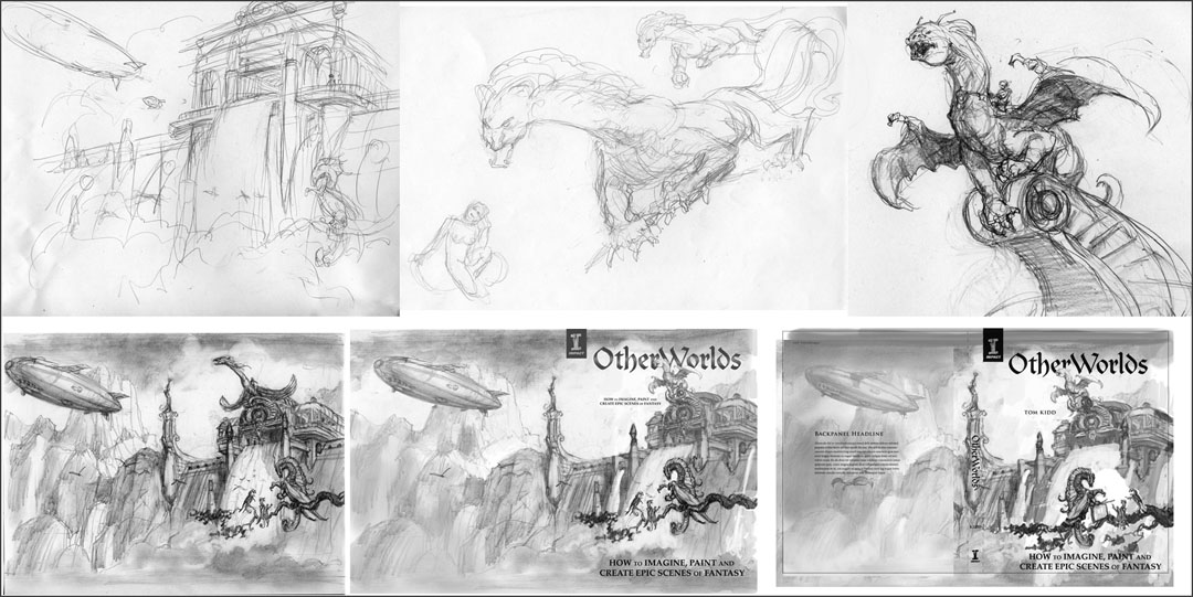
Above: First is my initial idea, some idea drawings of sculptures and then examples of me trying to get everything to fit in a pleasantly aesthetic manner with the cover design they sent me. Photoshop is used as an arranging tool.
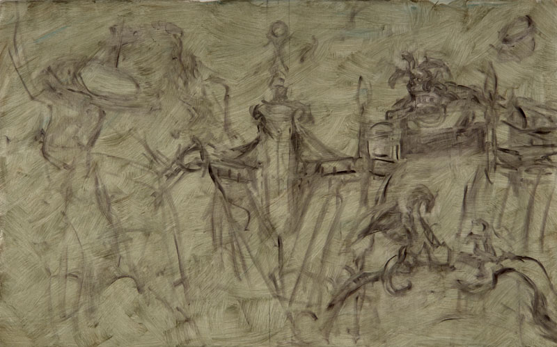
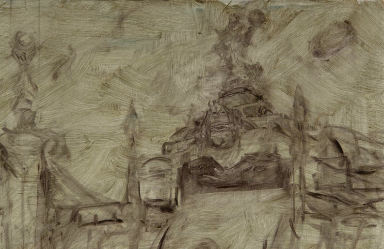
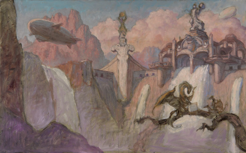
Above: Look ma, no pencil! The initial lay in is done directly with paint on pre-toned gessoed board.
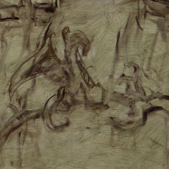
Above: Close-up.
Above: A change to the design takes place. The dragon sculpture becomes a goddess instead.
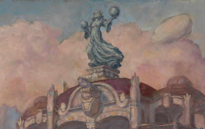
Above: This is a close-up of the change.
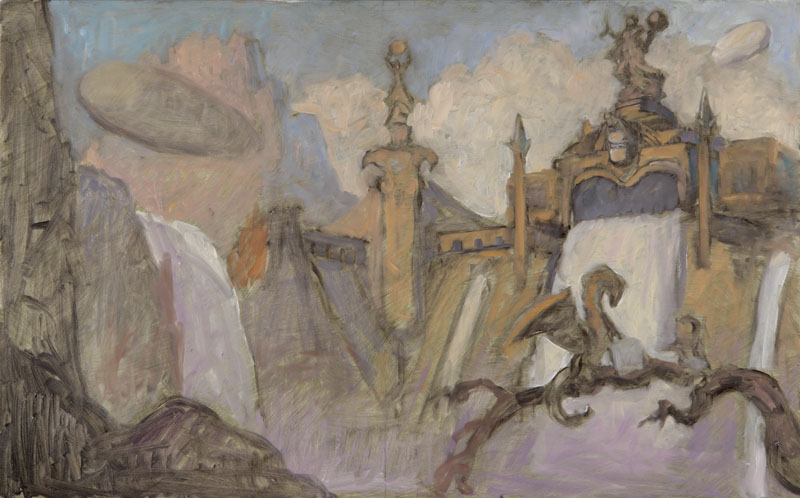
Above: Color is added wet into wet.
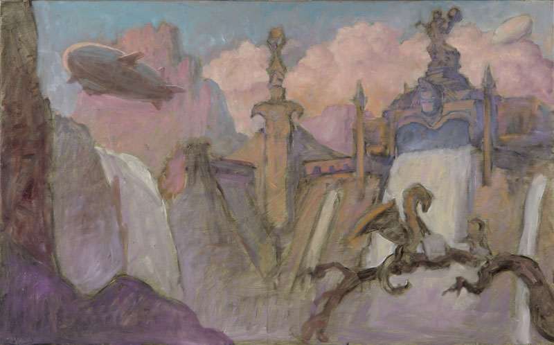
Above: Details are added and color is shifted to cooler warms.
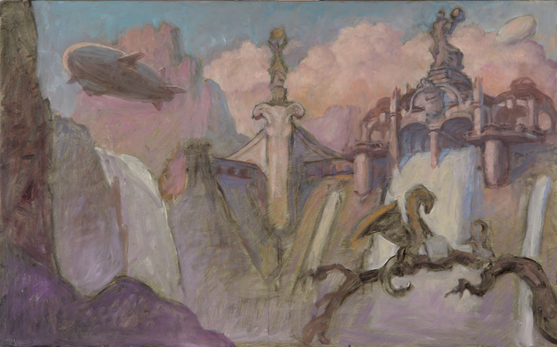
Above: The dam is changed and refined. I can never stick to a script.
Above: More refining, probably less than an hour's work. Note how the foreground dragon's wing changes but will change back. Can't make up my mind.
Above: So is this blog entry TMI, Too Much Information or TMI, That's Mighty Interesting?
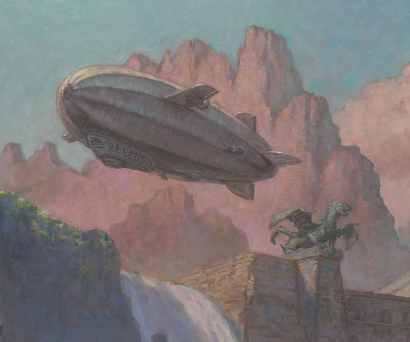
Above: A close-up of an area of change.
Above: The other area of change.
Above: The background is concentrated on.
Above: Knoll becomes grassy with texture and drybrush work.
Above: Early versions of the dragons' coloration.
Above: It's hard to tell what I've done but it has been refined.
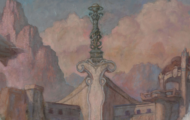
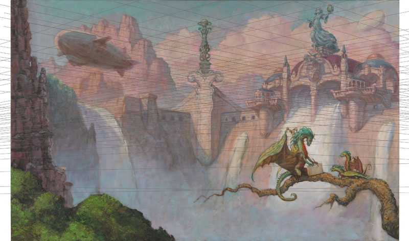
Above: You can barely see the lines but this is a perspective test. I've guessed it fairly well but adjustments are needed. Note that the spine of the book will line up with the column in the center. Type will go there.
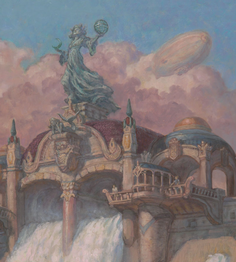
Above: A close-up of refinements. People are added. Can you see the mermaid sculpture?
Above: A shot of the detail. You can see how I turned and moved one of the dragon sculpture drawing ideas over here.
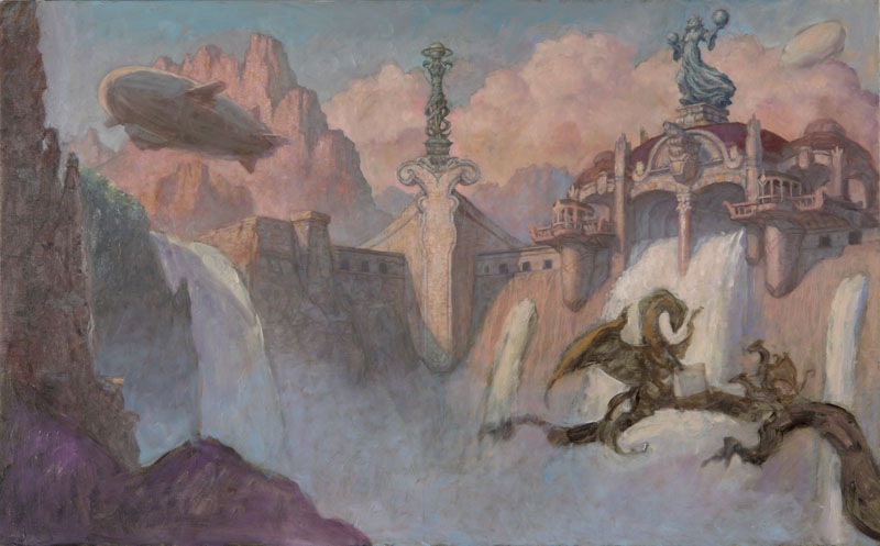
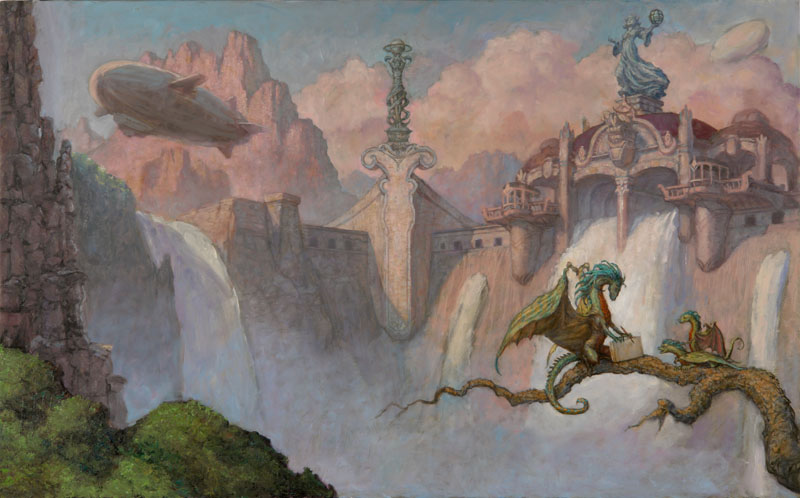
Above: The finish without any type over it. I've Photoshopped in some extra space around it to make it easier for the designer to place because I try to make other people's jobs a bit easier when I can. Click here to see it as a cover. It feels kind of empty like this. Click here to see a lot more of the book. Google put up a large portion of the book. I'm guessing the publisher knows and is okay with this. To buy it click on the previous 'to buy.' Remember what I said about making other people's jobs easier? That 'to buy' link makes the promotions department at Impact happy.
