Thursday, October 07, 2010

OtherWords: How to Imagine, Paint & Create Epic Scenes of Fantasy

 
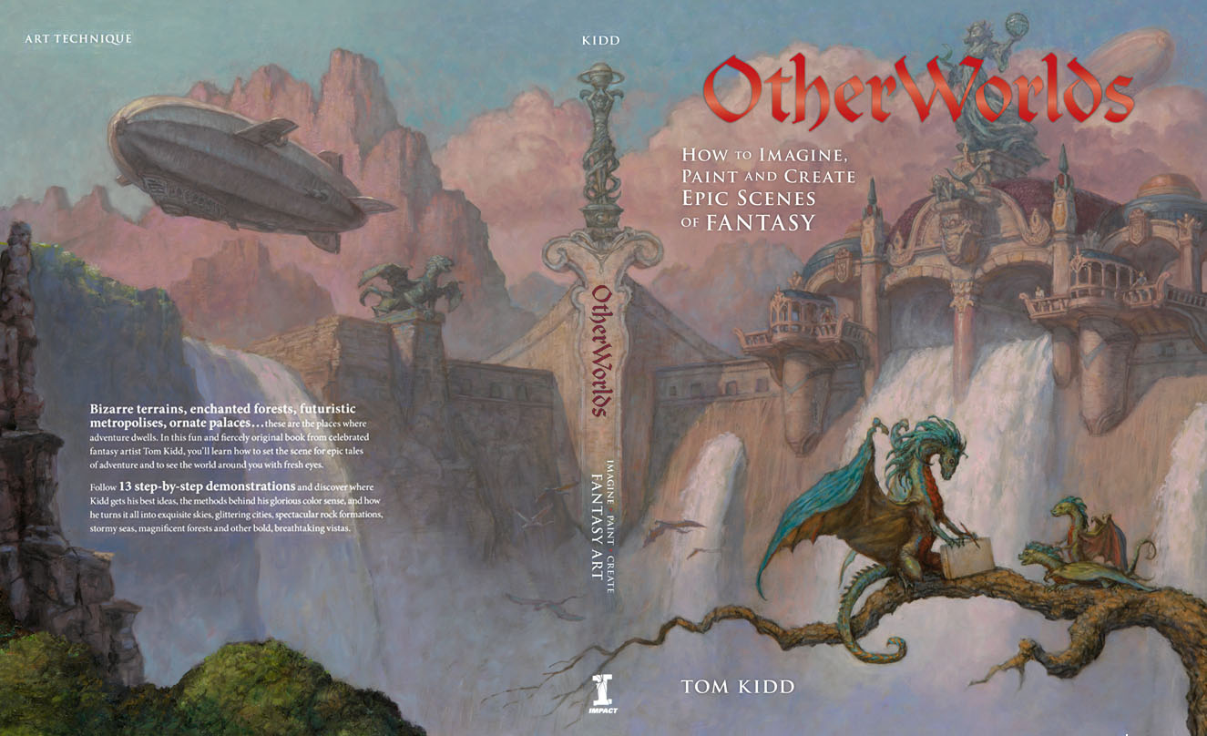
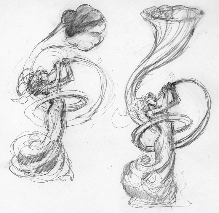
I wrote an instructional book. It's called OtherWorlds: How to Imagine, Paint and Create Epic Scenes of Fantasy. Click on this to see a video of it. The following step-by-step is of a book cover I did to give you an example of what will be in that book. However it's a new piece not in the aforementioned book. Next I'll do a step-by-step of the cover for OtherWorlds:

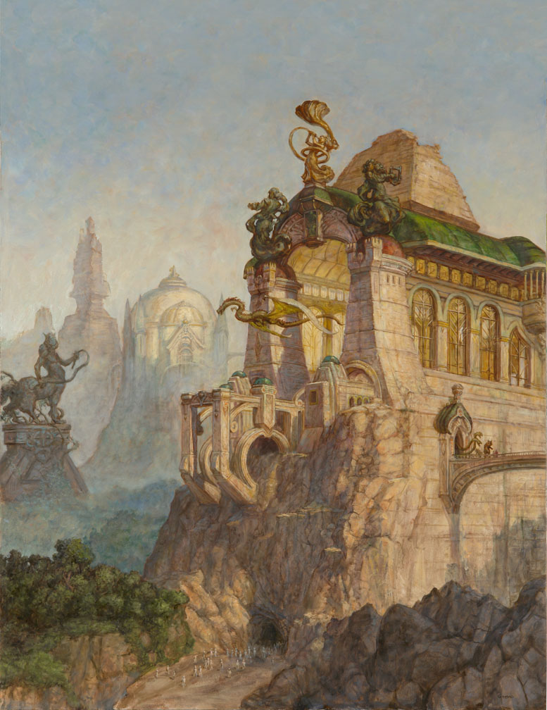
An anthology is a collection of stories. One way to represent this type of book is with cover featuring architecture and sculpture. It’s only a matter of placing the elements of the stories into a pleasing composition. The final painting should reflect an overall feeling of the book. In this case the feeling is of an ancient world of the future that is in decline. Feeling is important. As cold and static as architecture may seem as a subject it is very much a way to elicit an emotion and show drama.
Ideas (above): Start with a feeling and work towards refining it with thumbnail sketches done with a pencil. This will be a landscape populated with classical looking architecture of our future’s past. As such it will be difficult for us to fathom. It will be a bit of a mystery. You can come up with your own idea of its function but keep in mind that time has removed many of the clues as to what that is. Thinking all of this out will help you come up with an interesting final idea. Scan all your ideas and then feel free to modify them using your computer. You can move and resize the elements till you’re happy with the results. A bit of cross-pollination between ideas is desirable.
Throw on the Oil Paint . . . Figuratively (above): Once you’ve prepared a surface, in this case gessoed Masonite stained with a ground color, start laying in your shapes directly with paint. A large flat bristle brush is used to apply umbers (raw and burnt) but other colors like Mars violet are an excellent choice. If you’ve put down a very thin layer of linseed oil first on the surface it’ll make the applied paint a bit more fluid and allow you to easily wipe away to make your forms more intricate. Beyond getting your basic shapes down this should be a time to explore the idea further.
Throw on the Turpentine . . . Literally (above): While the basic lay in of umbers is still wet you can start adding opaque colors (Burnt sienna, Titanium white and Gold ochre) to represent the lit and shadow areas of the subject. This is supposed to be an aged structure. It’s not supposed to be a clean shiny new building. You want your paint to represent that and the paint is ready to do it if you give it a push. While the first two steps are still quiet wet dunk a brush in turpentine and splatter it on the painting. In that you already put down a thin layer of linseed oil as a start the turpentine will separate the paint and cause little veins and striations to appear as it runs down the painting.
The Nature of Liquid a Close-up (above): The effect of the dripping is both the start of a texture for you and some inspiration for a direction to go in as you paint. In this case I want the turpentine to reflect a quality of aging the way time and weather, in particular rain, changes a building. This is also a way to get immediate natural details into a painting. It’s left to dry overnight.
Sculpting out the Details as You Go: It’s perfectly okay not to have a completely detailed plan before you begin painting. Some elements are best left fairly rough till later. These two drawings are a refinement of what I want the sculptures to look like. They’re left mighty rough though because, once you have the basic idea in your head, you can work out the details as you paint letting the paint lead the way.
Making it Less Drippy (above): As you paint over the painting it’s best to maintain the drippy texture where it’s needed. You’ll certainly lose some but keep what you can. The key here is to make the structure feel more solid and give it form while keeping the texture. Using your paint thinly and sable brights as brushes at this point is a good choice. Start this process with large brushes and work down to smaller ones. At this point a few lines are added as guides for perspective that, until now, was guessed at. Notice how I changed my mind on changing my mind on the structure and I have now brought it back closer to the original plan.
A Note on Texture (above): If you find that you’re losing textural character as you paint there are ways to put it back. You can drag your brush across the surface to leave bits of paint, you can scumble, you can press anything with a texture into the paint to lift off or add paint, you can roll your brush on its edge or you can use a malformed brush that applies paint unevenly. All of these approaches are used here often on top of one another. This detail shows all of these approaches.
Define and Refine (above): A nice way of establishing your masses clearly is to take a painting only to a point you feel confident in them and then later refine them. Now some areas can be given greater attention and refinement. You can work out any area you’re not sure of first or an area you think will guide the rest of the painting. It’s still acceptable to experiment at this point. Touches of Viridian are glazed in areas to add color. The thinly applied green works well to simulate an aged copper roof because its translucency allows some of the underpainting show through. The inside of the structure, because it is largely composed of bounced light off of a warm surface is shifted towards orange more than the outside of the structure.
Light and Shadow (above): Light comes in from all three dimensions. This is easy to forget when you’re working on a flat surface. Although the light is clearly coming from the right side of the painting it’s also coming from a high angle from above as well. A change in the light’s axis will change the subject’s shadows, values and color so this all needs to be taken into account.
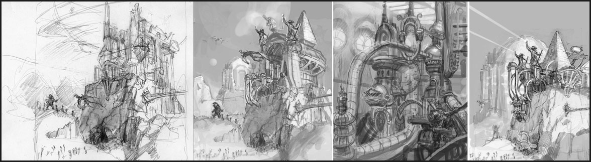
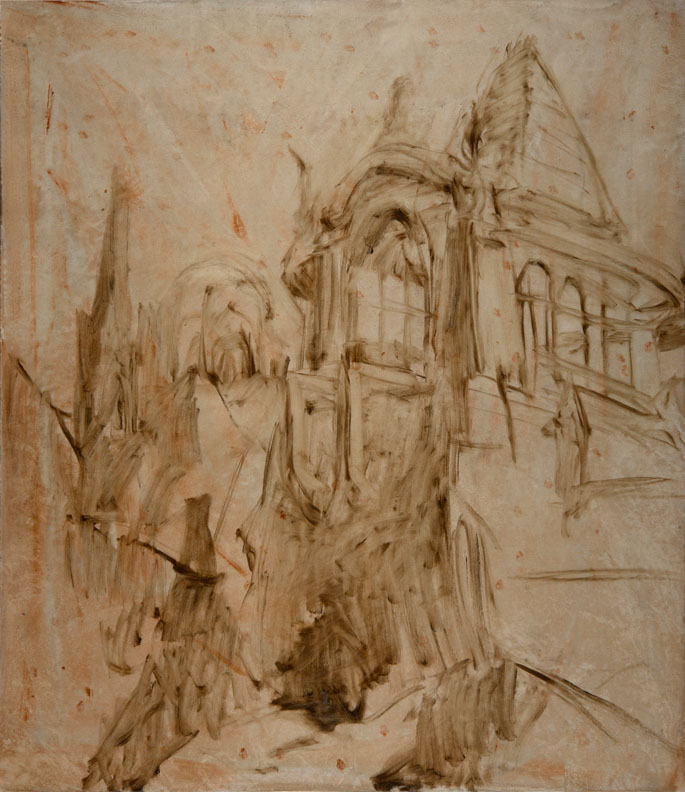
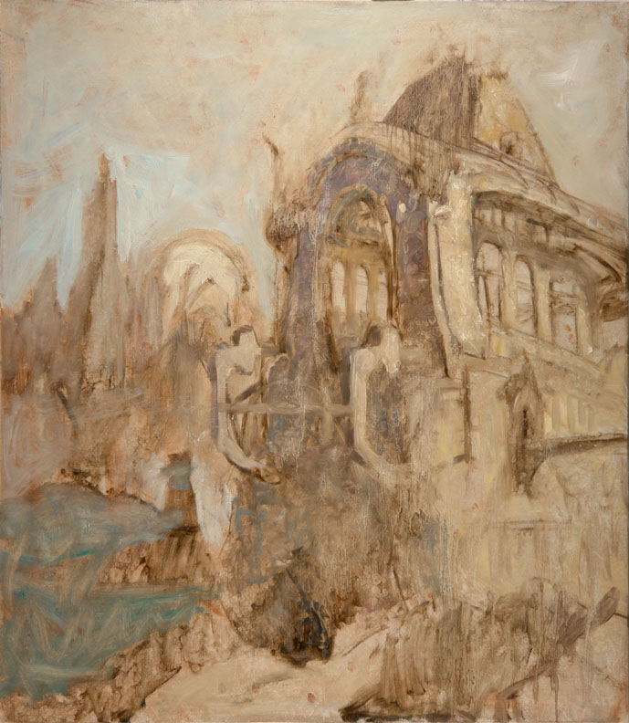
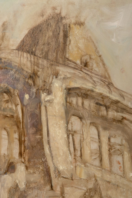
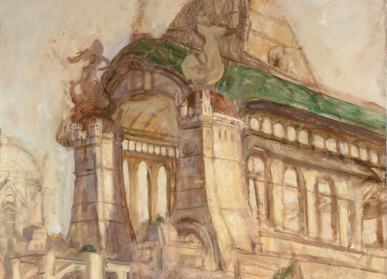
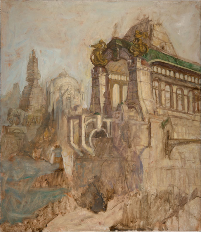
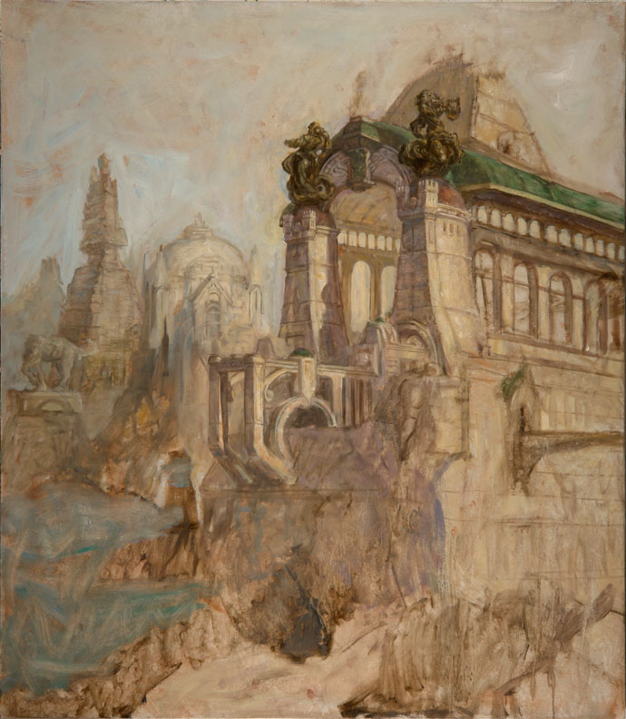
Once some of the smaller structural details are painted in additional shadows are added. Keep a keen eye on your architectural pieces for balance. Here the platform is widened to give balance. Even though you may have made up the figures for your sculptures you can study old outdoor sculptures (from life or from photographs) to imitate their textures and the way they reflect light. You’re mentally lifting a patina from them. It’s a bit tricky building the form and texture together because often one gets lost in another. You’ll need to find a equilibrium.
Back to the Drawing Board (above): Another sculpture is needed. You should try to paint it in directly but with a few quick thumbnails that take minutes you can test out your ideas and proceed with a bit more confidence. Notice how these are facing the wrong way. The sculpture was planned for another painting but it didn’t fit that one and flipped and place here instead.
Adding Details (above): The easiest way to add details like the center sculpture is to draw them in with paint. Thin down a neutral color with linseed oil and draw with it. You can easily wipe away your mistakes with a rag. Once the form is there you can add details to it. It’s best to always think ahead about what you’ll paint next in a painting. Some areas can be painted easily in one take but others are best laid in and then painted over again when it dries. Lush trees work best painted with dark leaves and shadows with highlights added later once they’re dry. That’s why they’re added in roughly before other details, to give them time to dry.
Inside Details (above): Any structure has an outside and an in. Here in this foreground structure you see a bit of both so you’ll need to picture both in your head even if all the details aren’t seen. Any imaginative painting requires that you mentally picture more than is seen. Typically it would make sense to paint all of the interior first and then the exterior. In that it’s mostly continuation of a repeating design it was left till now. Only the back wall had to be newly conceived. Because the large windows in the structure let in so much light the interior is aglow with warm light. Most of that light comes from what’s reflected off of the marble floor that can’t be seen at all. Your ability to imagine a scene logically comes into play here to give your picture verisimilitude.
Making Adjustments (above): It's difficult to imagine a solid structure like this so it’s likely you’ll find your mind has wandered and now you find something physically impossible in your painting especially if you did it somewhat on the fly as it was done here. Don’t worry, just make a few adjustments, add an overlap or two and it’s all fixed. Note also that the sculpture in the background has been flipped to keep the eye from running off the picture. Also, the straight edge of the roof is off putting so I added a rounded dormer over a balcony to break the line. To make the shadows uniform and have a nice color shift from the lit area towards a cooler color a light semi-opaque glaze is painted into the shadows using Transparent white, Manganese blue and Ultramarine blue (all of these are transparent colors except the white which, despite its name, is actually translucent, i.e. semi-opaque). At present the sky is warmer than it will ultimately be so some of the new anticipated blue from the sky would make it into these shadows. Unfortunately, this change causes nice details to be softened too much so they’ll be added back in the next step.
Save the Little Details for Last (above): Now that the larger areas are painted you can add small, complicated elements to the painting, more detail in the trees and to the structures and tiny people are adding giving the scene greater scale. All of these are important elements of the stories as well that work together to make an interesting picture. The background is pushed back a bit with Manganese blue and Flake white. An intermediary layer is added between the foreground trees and the background so there isn’t a sudden falloff to the background. Oil paint isn’t perfectly opaque so it will take a second layer of paint so the background doesn’t show through the dragon. Even though light shows through its wings you still shouldn’t see any of the objects behind it.
Blue-Skying (above):
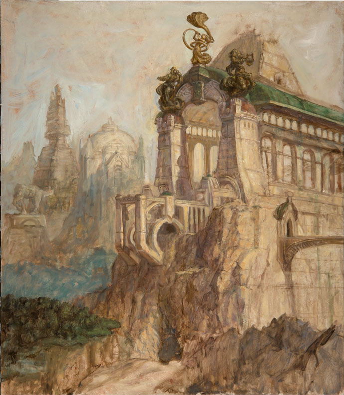
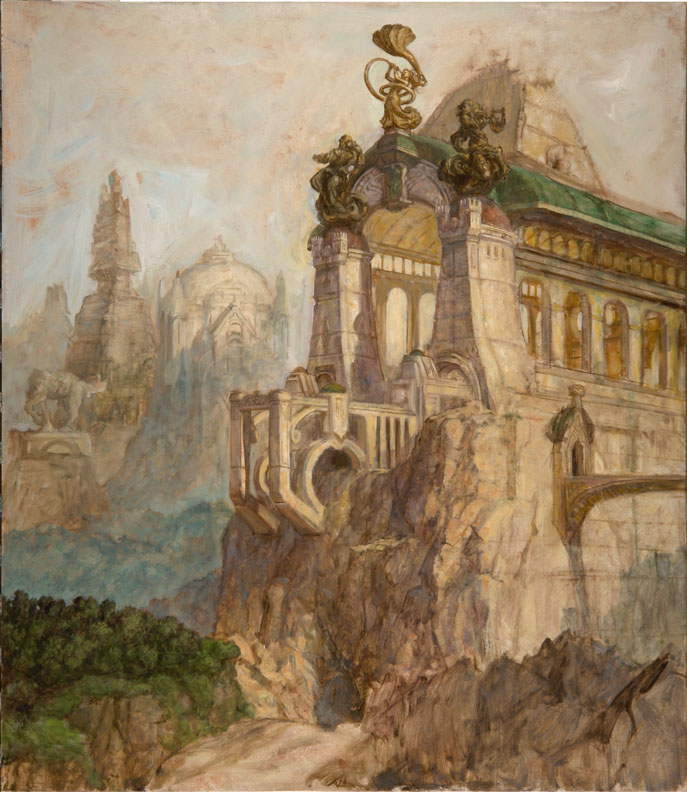
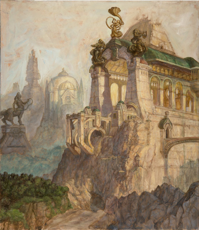
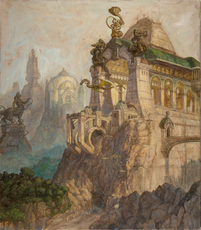
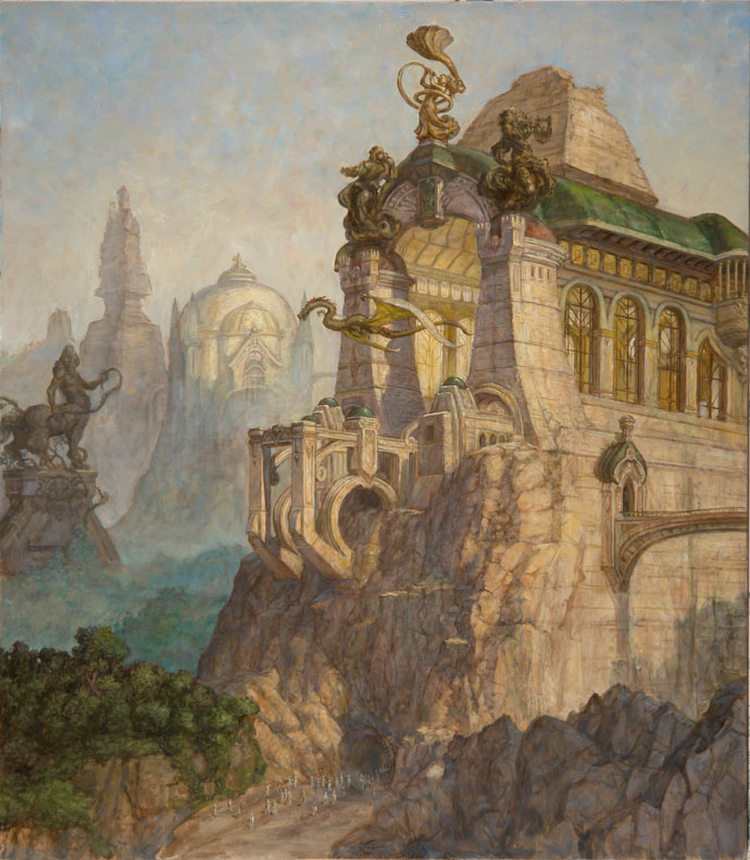
It might seem odd to save the sky for last but the advantage here is that you can use the sky to cut into all the objects giving them carefully controlled edges. Notice how the sky is duller towards its bottom. This is to give the picture a dusty dirty feeling. You’ll see this often in polluted areas of the country. Whatever the case the sky usually does this to some degree anyway. It’s never a perfect blue. Now that the sky is in it became apparent that the background needed to be even bluer. For the final, tiniest, details a #1 sable round is used, like for example, in the details of the crowd of naked people.
Traditional Meets Digital (above): After a few more final details it’s time to go digital. This is a book cover and therefore needs a bit more space on top for type. If it’s not done with physical paint you can always add it later digitally using a rubber stamp tool available in Photoshop. And there it is easy-peasy-lemon-squeezy.

11 Comments:

Blogger Unknown said...

Wow! What a wonderful post! The book looks amazing, it's going strait to the top of my list, and thank you so much for sharing some process here on your blog as well.

Thank you!

2:24 AM  
Blogger Tom Kidd said...

Thanks Brian. I hope to put up a few more of these. This post took longer than I'd thought it would. Blogspot has changed and I forgot how some of it worked before.

This cover was for "Hard Luck Diggings" by Jack Vance, published by Subterranean Books. The step-by-step part of it was actually done for Rob Alexander's "How to Draw and Paint Fantasy Architecture" due out soon I think.

1:53 PM  
Blogger Jared Shear said...

Cool!.....looks like a must have book. Great post Tom. Can't wait to pick it up.

8:39 AM  
Blogger Tom Kidd said...

Thanks for stopping by Jared. Now that I have no books to write I'm blogging again. I've got another step-by-step coming up and then some dragon drawings I think. Often when I'm buried in assignments ideas come to me and become pent up. It's time I start releasing some.

4:41 PM  
Blogger Mary Sheehan Winn said...

Tom,
you are an amazing artist. This step by step rocks.
You had me right from the oil sketch. Beautiful.

4:49 PM  
Anonymous duke said...

Tom,
i'm a chinese girl.i love your "Gnemo" very much,but in my country i cannot find your books,so i ask my friend who's studing in the USA for help "buy Tom's books for me!"...hahaha...
by duke

8:46 AM  
Blogger Tom Kidd said...

Thank you very much Mary. I've got some fun projects coming up that I'll be sharing here. The trick with doing step-by-steps is to get the important information in without making it too tedious. I'm going to use the blog to work on my writing skills. Practice, practice, practice.

12:55 PM  
Blogger Tom Kidd said...

"Duke" I had a gallery of my paintings in Fantasy Art Magazine in 2007. It's published in China. I posted here about in on April 28, 2007:

http://kiddography.blogspot.com/2007/04/chinese-gnemo.html

Let me know if you find it.

1:29 PM  
Anonymous duke said...

Tom,
i buyed that magazine in 2007,and it's the first time i knew about the world "Gnemo"...thank you Tom,thanks your Gnemo too,i love it
by duke

2:17 AM  
Blogger Paul Twinz said...

Tom, I run a non-commercial blog called Marooned: Science Fiction & Fantasy Books on Mars. I love your Help Defend Australia tripod poster. Would it be possible to use the image, with a link back to your site, for a simple post ahead of the Orson Welles War of the Worlds anniversary?

Thanks for your consideration.

Paul

http://sffbooksonmars.blogspot.com/

5:03 PM  
Blogger Tom Kidd said...

Paul, I've written to you directly to say yes. You've likely already read that message. Let me know if you missed it.

3:35 PM  

Post a Comment

<< Home