Several Inks & A Pencil
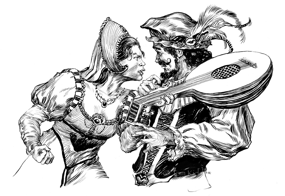
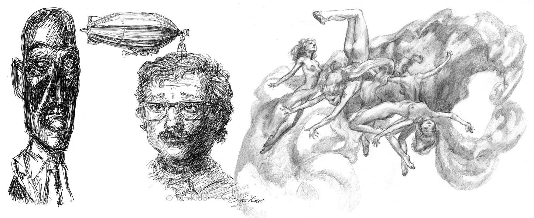
I have a bunch of pen & ink illustrations to do. To warm up for them I do little inkings. I really love the immediacy of the Pigma pens. You pick one up and you’re inking away. All of these pictures are small, doodles really (except the one above). The point is to get myself relaxed. Ink goes down and stays down. Paint isn’t harsh and unforgiving: make a mistake, wipe it away, do it over. A brush, works for me like a shock absorber, softening the unfortunate shake in my hand. So watch me ruin a couple of these. The one above is an illustration for a book by Orson Scott Card titled Hamlet’s Father. It’s not a test but a finish illustration included so I could have a picture at the top. It was done with Black Magic ink using a #1 W&N sable brush.
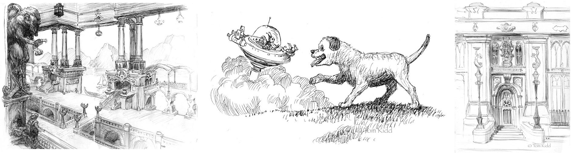
Above: These first three were taken from my transmogrifying sketchbook. I kind of draw from life and change it to something a little or a lot different. Most of these are drawn lightly with pencil and drawn over with a ballpoint pen. Starting at left is a balcony I was sitting on. I changed it quite a bit, mainly using the perspective. It’s both Pigma pen and ballpoint. Next is a doggy I saw running around. In this case I did a few drawings of the puppy separately and redrew it in the scene above. It’s pretty corny but sometimes I want simple, corny and cute. I need to learn how to draw dogs better from memory so this was a useful exercise. I used a Pigma pen on this one. The last one is a bank in town. I fancied it up some. It’s ballpoint.
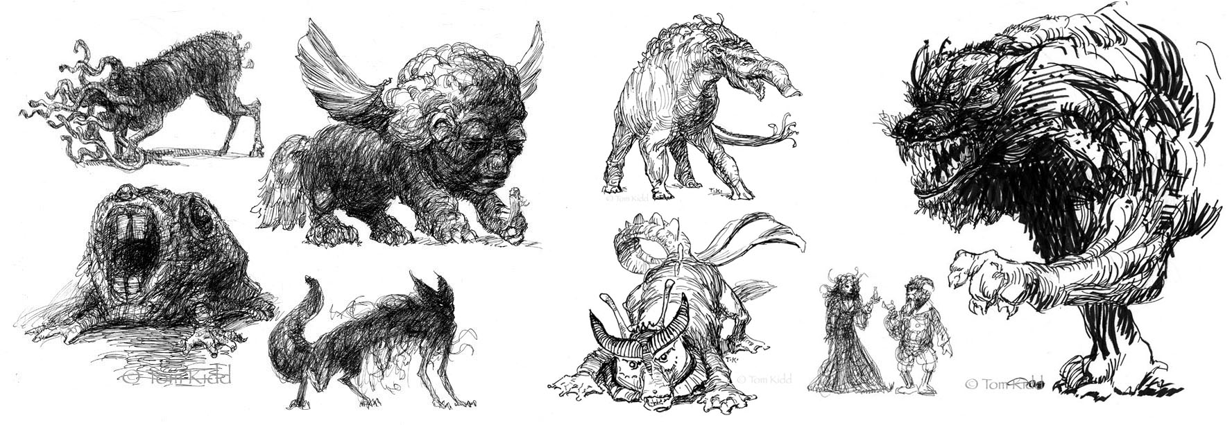
I call the things above id creatures. They’re all over the place it you look carefully, in marble, in stained carpets and in lichen. All were all done with Pigma pens or brushes of one kind or another. The Pigma brushes don’t have the control of a sable dipped in ink but they’re useful when putting down heavy blacks and they don’t cause horrible spills. Some of these were done directly in ink without drawing. Often I get story ideas from these doodles.
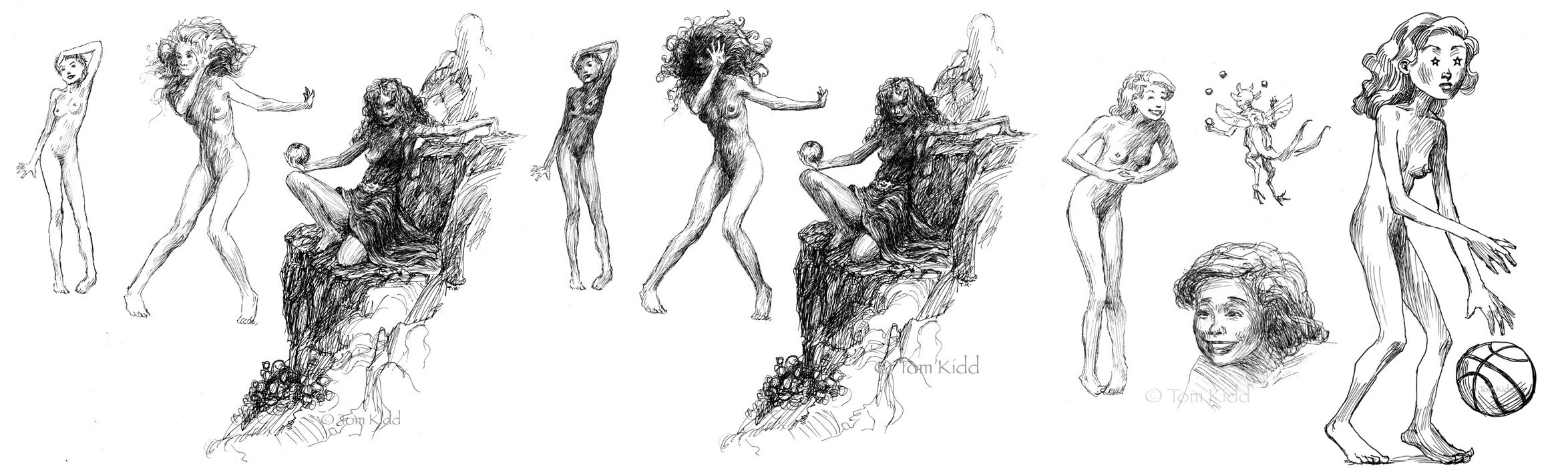
Above: These first two sets are an exercise I call ‘keep inking till you ruin it.’ First I inked the three figures till I was satisfied, scanned the group and inked more. How better to know when you should’ve stopped than to go too far? The girl with her hand on her head is a mess in the second version but the girl holding her hand up still looks okay. I like how the hand stands out now. The mountain girl still looks okay too. It’s a matter of taste on this one. The story behind The Mountain Girl is that she’s a wild feral creature. What’s with the dress, you may ask? She “found” it, tried it on, liked it and is hoping to gain some sophistication by wearing it. Next is the fairy juggler who has charmed the clothes off of the lady he’s entertaining. I often do better with facial expressions when I draw small so after I got the big smile down right I felt I should try it up larger. My wife saw the basketball player with the stars in her eyes and said, hey, her arms are too long. Wrong! Her torso’s too short . . . and her legs a bit. Not to mention the massive hands, feet and head. Cartoons don’t care about their proportions and if they don’t why should I?
posted by Tom Kidd at 8:43 PM
![]()
![]()


15 Comments:
You are very adept with the ink pen. These are great! I like the idea of the "keep inking un til you ruin it", although I think I'd end up putting down maybe one or two strokes before I had to stop. I really have to put down the pencil marks first otherwise I just end up going through reams of paper and copious bottles of ink.
Nice ink work on that top piece Tom!....beautiful.
Thanks for sharing these little warm ups.
Thanks Michael. I dream of inking like the illustration masters of the past. It'd be nice to paint like them too. Most of my direct inks are failures. I'm in my fortieth year of drawing on a regular basis and still there are some days I can't draw what's in my head. Fortunately, after a couple of days, those ideas usually work their way through my thick skull.
Thanks Jared, You can probably tell I like writing as much as I like drawing. Less words, more art might be a better approach. I did a cover and twelve interiors for "Hamlet's Father." Illustrating Shakespeare wasn't easy. Too many great illustrators have had their hand at his plays. This book is something of a rewriting but the scenes are pretty much the same. I did all the interiors with pen & brush.
Hi Tom
This post came at a very good time for me because, as it turns out, I have 15 ink drawings due by the end of the month and once again your work has inspired me.
Thanks again for your honest and humorous blogging.
You're welcome Larry. I look forward to seeing a few of the ink drawings on your blog. You always post great stuff.
These are fantastic! I've got a couple of books, collected works by Joseph Clement Coll and Franklin Booth, which I drool over occasionally. I really admire good inking ability. Dispite my efforts, I have yet to 'absorb any of their power.' ;)
fantastic post Tom! Love the narrative, 40+ years and still having fun! I still go through the Tundra sketchbook I bought years ago- one of my art bibles.
Thanks for sharing and for teh inspiration!
Thanks Nasan. I went to your blog and asked you a lot of questions about your video. It's time I be open about my technical ignorances. I've greatly admired Coll and Booth from the instant I saw their work. There's a poetry to well done and sophisticated pen & ink art that can't be achieved with paint. Every medium has its special qualities but ink is unique to those early days of illustration and those simple black lines are still full of potential as evidenced by its present practitioners. I don't include myself here . . . but that doesn't stop me from trying. Brave + hubris + stupid = Tom.
Wow, Aaron, you've got the sketchbook! It's been long out of print. If I can get myself organized I'd like to do a new sketchbook on my own, a big one. To publish on my own though I'd need to put in some storage space here. Thanks for your comments on my inkings and that old book.
HI Tom! What a pleasure to watch these inks! I love the Shakespeare one for two reasons: first I love Shakespeare's work and all this universe around him; second you illustrated it magnificently! I agree that we feel a Clement Coll inspiration, but I'm thinking to Gustave Doré too. But Coll has a "modern touch" that make look younger this ink art. And you did it too as well!!! :D
Thanks for your description and explaination of your work. I've just a question even if I didn't understand very well, you used an ink pen? Is it easier than a "feather"?
PS: A BIG new sketchbook will be a great idea! :D
There's Wrightson who uses ink, doesn't he? I talk about the work on Frankenstein
Oh yes, Camille, I love the work of Gustave Doré. Much of his printed work was redone by lithographers though. I have a book of his drawings and paintings as well as all the reprints of his illustrated books. When I was in Paris I went out of my way to search for his sculptures. He did a great one in honor of Alexandre Dumas. I remember his take on d'Artagnan in particular. Fantastic.
I use several things to ink with: marker pens, a variety of crow quills and brush, sometimes combining them all. A friend of mine suggested I make and try an actual feather quill but I've never done that. I have some feathers here to try. Thanks for reminding me of this.
Wrightson is the guy to study when it comes to complicated pen & in work. He clearly studied Franklin Booth but made it his own. A contemporary to study in terms of pen & ink and in general is Gary Gianni, he's pretty fantastic. Look him up.
You're work amazes me Tom. I haven't seen a lot of your pen and ink work.
Thanks Brad. That means a lot coming from a master like yourself.
Post a Comment
<< Home