Leave Well Enough Alone? Hardly!
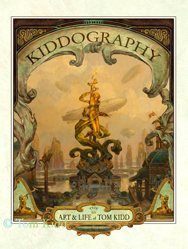
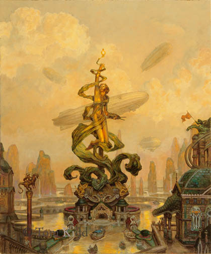
Back when I was working on my book “Kiddography” I decided I’d do a new painting just for the cover of the book. Each night, after a long day of writing and laying out the book as well as doing in my regular work, I sat down and did idea drawings for the cover. When I had a few of them I sent them out to friends with this question: Does this reflect my personality? My very nice friends kindly told me none of them were quintessentially me so I went back to the drawing board and did something I liked. I then went to painting it without further input. Trouble ensued. The Quark file for my book became corrupted and, without knowing it, I saved the corrupted version. I know ways to prevent this now, but I didn’t know it then so I had to redo 50 pages of work. This put me terribly behind. Paper Tiger wanted to see the painting and it wasn’t done. I sent it to them partially finished and I told them it was incomplete/in progress. About a week later they told me, after showing it around, that they were going with something different because that painting looked . . . “unfinished.” Pretty funny eh? Here’s what the cover to “Kiddography” would’ve looked like had they liked it.
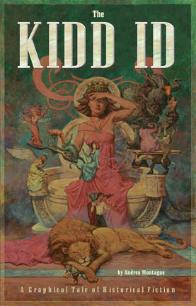
Just for fun, here is another cover that was done with a very different concept for my book in mind. They rejected everything about this.
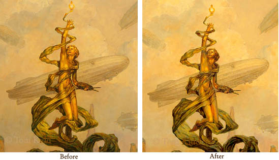
Yesterday I changed the painting. I’d been planning to for some time because of a trip to Montreal. There I saw a gold statue in the warm morning light. Looking at it I said, wow, that’s how it’s done. I could see how the gold picked up more of the ambient light from the sky than I’d expected and how much more orange the reflected light into shadow was than I’d thought it would be. At the time I originally did the painting that level of color contrast seemed garish but when I compared the painting to the photograph I took of gold statue at the right time of day I felt I had to make a change. Here’s a close-up of that with a before close-up. It’s not quite there yet; maybe I made a mistake; I hope that I learned something. Take my word for it, the original looks better than this little jepg.
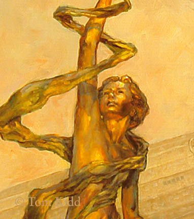
Here’s another even closer shot of it to compare.
I also changed the entire painting in other little ways but probably nothing you can see here.
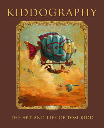
By the way, this is what the cover to Kiddography really looks like.
The next painting I put up that I’ve changed will be quite a bit different from the first version. Here I was just testing a principle, perhaps at the expense of a painting.
Just for fun, here is another cover that was done with a very different concept for my book in mind. They rejected everything about this.
Yesterday I changed the painting. I’d been planning to for some time because of a trip to Montreal. There I saw a gold statue in the warm morning light. Looking at it I said, wow, that’s how it’s done. I could see how the gold picked up more of the ambient light from the sky than I’d expected and how much more orange the reflected light into shadow was than I’d thought it would be. At the time I originally did the painting that level of color contrast seemed garish but when I compared the painting to the photograph I took of gold statue at the right time of day I felt I had to make a change. Here’s a close-up of that with a before close-up. It’s not quite there yet; maybe I made a mistake; I hope that I learned something. Take my word for it, the original looks better than this little jepg.
Here’s another even closer shot of it to compare.
I also changed the entire painting in other little ways but probably nothing you can see here.
By the way, this is what the cover to Kiddography really looks like.
The next painting I put up that I’ve changed will be quite a bit different from the first version. Here I was just testing a principle, perhaps at the expense of a painting.
posted by Tom Kidd at 11:04 PM
![]()
![]()


2 Comments:
Gee I wonder how many hours of paid brainstorming and time-wasting it took them to come up with that idea. Reducing the image and typing the title on top and the author on the bottom. Anyways I think your cover painting rocks and all you can do iis make a rocking cover painting and hope the editor decides to use it, right?
P.S. I really admire your approach to picturemaking and if you would look at some of the paintings on my blog I would be honored beyond description. Cheers! -K. klumsyk.blogspot.com
Konstantin,
In the end I was satisfied with the cover. My friends said it reflected my personality just fine. As an illustrator I can see the art director's point of view more often than not. Sometimes I get some bad art direction that ends up reflecting poorly on me. It can be frustrating to hear someone complain about something in a picture that I was specifically told to do and I'd advised against. An illustrator's power of persuasion my be his or her most important ability.
Post a Comment
<< Home