The War of the Worlds (click for Amazon link)
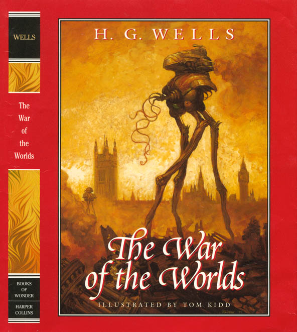
There's plenty of new stuff to post but I got to thinking about my War of the Worlds stuff because I went to Andrew Glazebrook's Blog (scroll down to see his tripods). It made me want to post some little-seen images. Above: Cover for the book that came out in 2001. I did 17 paintings for the book.
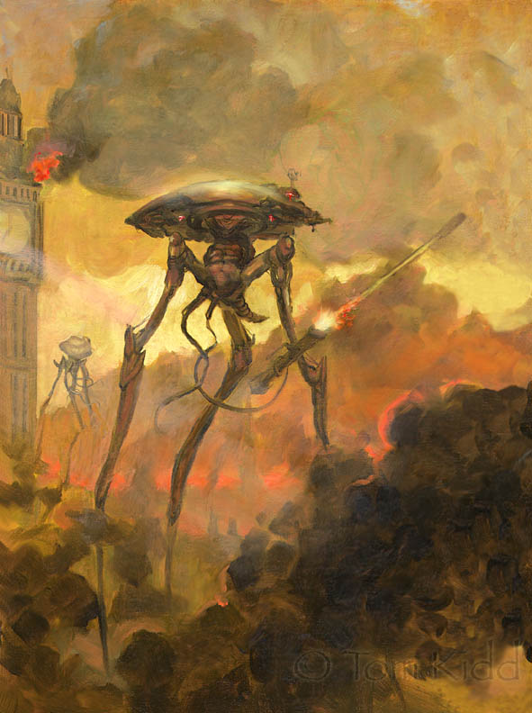
Above: This was my alternate design for the cover. It's just a color sketch.
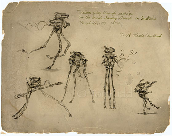
Above: How I imagine someone out in the field might have sketched the Martian war machines (tripods) from a distance.
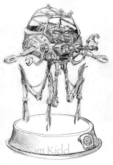
Above: Design for a War of the Worlds chess set. It was never made. The Queen.
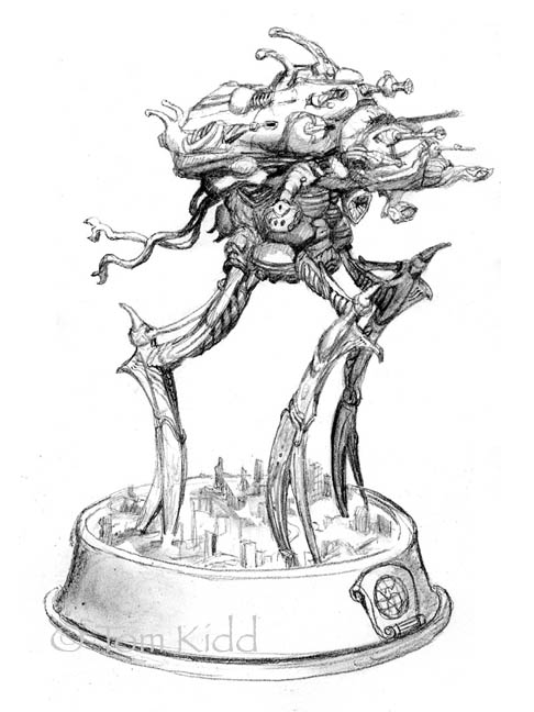
Above: Here's the rook from the chess set. I wrote a whole story to go with the chess set too. It was too 'weird' for the client.
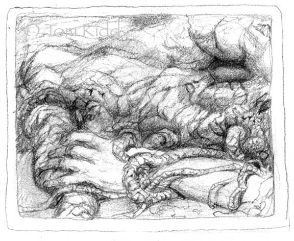
Above: This is one of the earliest drawings I did for this book. It was done before I moved out of NYC so I must've been in my 20's when I drew it. The company that assigned me the book went out of business before I could get very far. Did you know that H.G. Wells' Martians were vampires?
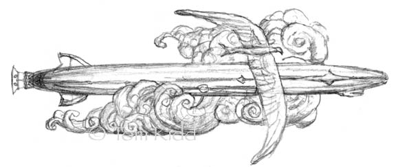
Above: What does a zeppelin pin design have to do with this subject? I say stay tuned. One day it will be revealed.
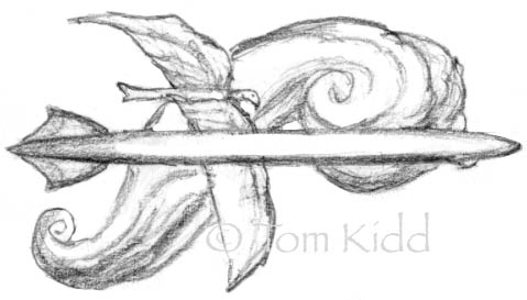
Above: I'll be making the two designs above in wax to later be made into bronzes.
Quite a few of my War of the Worlds paintings and more sketches can be seen in my book Kiddography.
Labels: science fiction


29 Comments:
Excellent work!
I love the organic feeling of your tripods.
I also like your B&W pencil drawings, just lovely.
I've put up a new post for Gnemo's Sketchbook. The idea of the swinging marsulephant was suggested by William Wray. I plan to explore this further with a whole bunch of them swinging around. For now I just liked this simple sketch. Also, you'll find a portrait of Gnemo from his teenage years here:
Gnemo's Sketchbook
I love these suggestions from people. Please keep them coming. I'm listening. Too often I overlook the obvious. Thanks again Bill!
Very cool, love the black and white stuff
I think that posting the historical content is a good thing, adds context, shows range both for the artist and his creations (Gnemo). You have created a fascinating duality.
WOWOWW!!! A fantastic array of work Tom. Such a grand post!!!
Beautiful work!:o)
Great stuff all around Tom.Loved the image the first time I saw it in Kiddography. Speaking of...look what I just found :
http://www.imaginefx.com/02287754330019144705/kiddography-the-art-and-life-of-tom-kidd.html
Tom Kidd, in a digital art book -who knew?!
Tom, your work reflects a rich and vivid imagination as well as technical aptitude and finesse!
Gabriele, the tripods come directly from H. G. Wells' words. He said that the Martian war machines had no gears and that they moved fluidly, like animals. From a 21st Century point of view I had to interpret that as an internal musculature. We're beginning to build machines like that now.
If I'd be asked to be involved (I got an exploratory email) in one of the many WW movies the tripods would've had personality. There was logic to the tripod design that was overlooked in the movies. In my vision their gestures would have resembled those of Earthly predators and they would've moved quickly tearing up the ground while spewing smoke like a locomotive. One thing, not in the book, that I think would be neat in an updated version would've been little fast moving tripods. I know just how these lithe machines, large and small, would move and it would scare the bejeezus out of you if you saw a machine move that way. Anyway, look at the group sketches and you'll begin to see what I mean.
I'm not so irritated that I wasn't involved as I am that a great opportunity was missed to realize Wells' words. They would've gotten my advice for free but they'd have needed my drawings to fully understand my advice.
Scott, thanks for the Kiddography link. I think that's pretty old though. Someone told me about it months ago but that link is new to me. I'm just self-absorbed enough to have bookmarked it. They're right about there being no good step-by-step in the book. It was going to be the cover but they chose a different painting for the cover. I need to do another one of those step-by-steps here on the ol' blog. Maybe I'll do what Mattias has done with the little movies but that may be beyond my abilities. You should check out his stuff.
Hey Ron, I think that the duality/multiple personality thing is contagious. You may already have it.
Thanks, everyone.
whoaaaa this is so AWESOME!! I love the paintings and the sketch, fun stuff
=D
Wow, The Kidd can paint!
Thanks for stopping by my blog. I followed your link back here...wow, you're quite the talent. Excellent work.
These W of the W peices are great. The read border makes me think of Time magazine.
That's so cool you went to school with Scott McCloud! He's become my champion because of his endorsement of webcomics.
That's so cool you went to school with Scott McCloud! He's become my champion because of his endorsement of webcomics.
Amazing work my friend!
wow! those are great tom! i have a 'war of the worlds' book, an old beat up one i picked up at a yard sale but have not read it yet. i think reading one with those illustrations would be way cooler! i like the movies, (old school one is best!) here in seattle, we have the sci-fi museum and they have quite a nice exhibit with WOTW stuff. (uh-oh...see what you did, you let scary sci-fi girl out here!) :] anyway, i did not know that the martians were vampires in h.g.'s version! that's pretty interesting!
I love your take on this classic.
Excellent execution and interpretation.
I'll be by often.
Cind, funny you mention that museum in Seattle, one of my paintings from WOTW is part of that exhibit. I did two different endpapers for the book and they have one.
how cool is that! i am very impressed!
Like Cinderelly, I too have a copy of WOTW that I haven't got around to reading yet and I think that I might have done so quicker if these illustrations were it it. That cover is quite an eye catcher. And I'm very happy that you include your pencil sketches-the devil's in the details.
Great stuff, Tom. The cover is outstanding. May seem an odd detail to pick out, but I especially like the Queen's legs, too. Always loved those kinds of lines, shapes. They make me want to draw a strange old tree, right now :)
Thanks very much for the kind words and the recommend as well. They mean a lot, especially coming from you.
creepy cool. too bad they couldn't use that alternate cover, I like it just as it is. the chess set idea is funny, it's staggering how many themed sets there are...always makes me wonder if folks use em or just display them.
Great designs! I love the mood of that cover painting, nice work!
What can be said about this post...! Too damn good! Perfection!
Man, all these Tri-pods stuff is pure eye candy ! You made my day with that great "War Of The Worlds" covers. Merci beaucoup ! ^^
Julien.
Thanks to all for some very fine input here. I'd never noticed the Time Magazine similarity. Maybe I should do a faux cover for that magazine for the day the Martians invaded. It would certainly be featured on many magazine covers so there's a number of possibilities.
I really love the work you did for this! There are so many great pieces that you've posted I want to set more time aside just to give them a better look!
Post a Comment
<< Home