Sunday, October 31, 2010

Segrelles Tree: A Horror Story

Below is a excerpt from my book Gnemo:
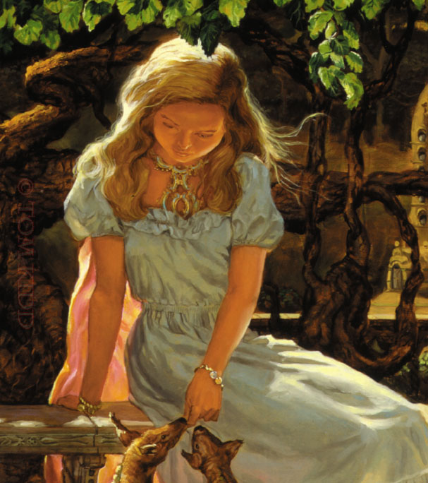
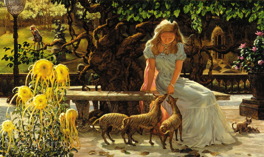
The lovely Casso beckoned me to sit next to her on a bench that circled a tree. As I sat she pulled out a piece of paper and she read me her terrible poem:
Gentle creatures come close to me
Take in the sweet musk of my tree
Her scent will make you float on air
and newly freed of any care
Limp and placid, without a fear
The end of you is very near
My love needs you inside of her
In you go with nary a stir
I give to you one final kiss
Your sacrifice releases bliss
My lovely tree will now release
A misty dust that gives me peace
Great euphoria envelops me
I love you my Segrelles Tree

A voice in the back of my head yelled run, and not from the bad poetry alone, but the intoxicant released by Casso’s beautiful Segrelles Tree held me in her charms. Lunch to this tree seemed to be my unavoidable destiny. Casso’s addiction required my sacrifice but her confidence in my love let her release me with the full expectation I’d return for dinner.
-- Gnemo

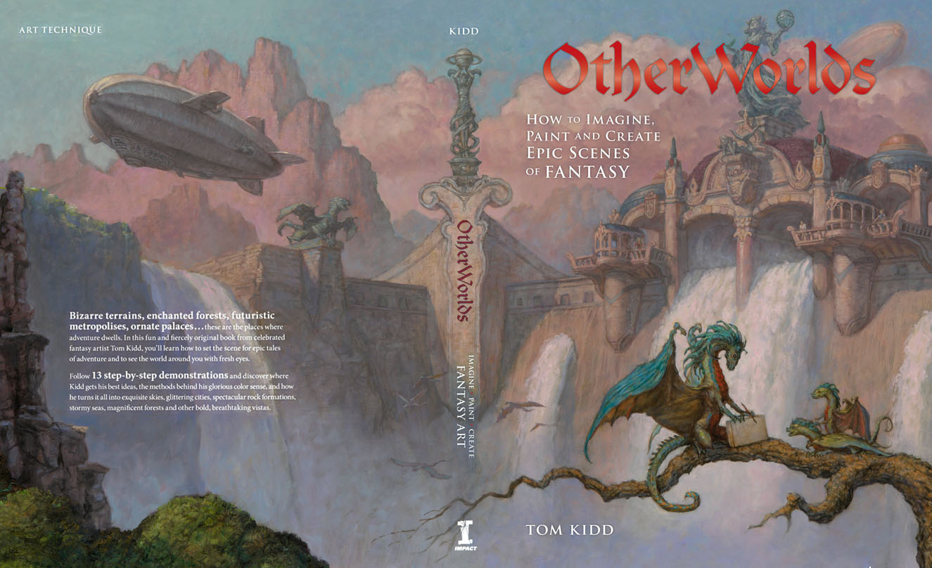
PS: If you haven't yet, please buy my most recent book OtherWorlds: How to Imagine, Paint and Create Epic Scenes of Fantasy.

Monday, October 18, 2010

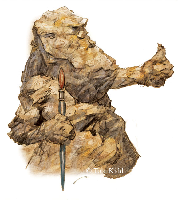
The Pencil Ogre & The Stone Cold Artist


    Last night I was watching TV and I got an itch to do some art but I was mighty tired. I’d had a long hard day. Normally I like to sketch on nights like this but I decided I wanted to paint something I’d already drawn. Sometimes I reach for my watercolors but it’d been a long time since I’d used my little MacBook and Wacom together and I didn’t want to leave the couch. My main art computer is on a platform that’s meant for standing. I do most of my work standing up. It suits me. The laptop allows me to “watch” TV and draw or paint at the same time. Just don’t ask me anything about the plot of the show. It was Mad Men – someone’s pregnant, someone’s getting married, someone’s getting screwed (in all its forms of meaning) . . . something like that.
 
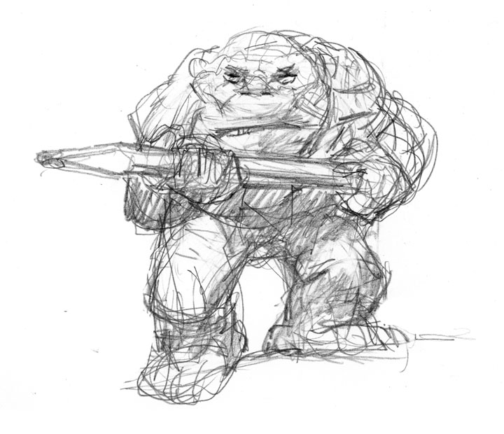
    Above is the sketch. It appears in my new book OtherWorlds under the chapter “Sketching Your Ideas.” I think my title for this section was “The Mighty Pencil” but it was changed. The Giant Pencil Ogre is to remind us to start our idea sketches roughly because the sketchier we artists are the more ideas we’ll generate. The neater your initial drawings the more closed your mind will be.
(While I’m plugging my new book, click here to see a few pages from it. Once there, click on each picture to see the next. You’ll end with my web site open.)
    * If you're not particularly familiar with Photoshop you should click on the picture above and take a look at the screen grab. Three of the pertinent areas are circled in red. I'd flattened the art for the Pencil Ogre but the Stone Cold Artist still had its layers seen in the palette on the right of the picture.
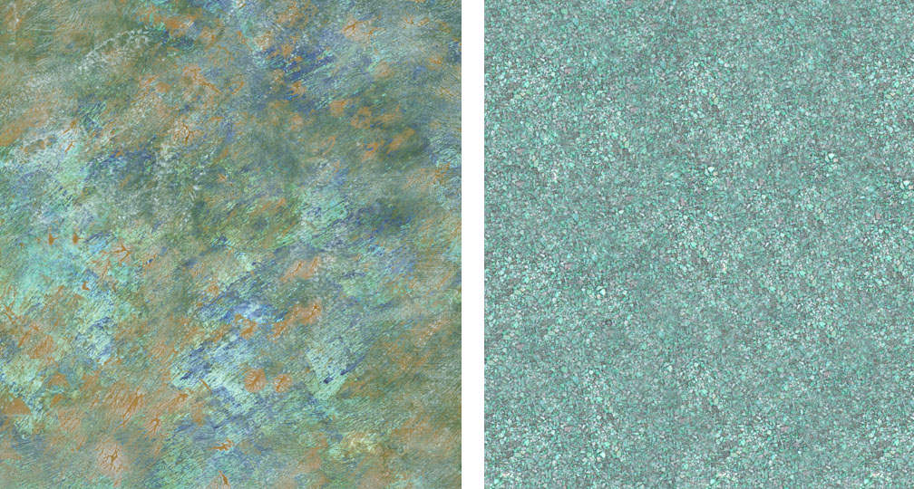
    To start I opened my sketch in Photoshop and imported the painting texture and turned it into a “Multiply Layer.” Using the “Magic Wand” I selected the background of the drawing (the white around it) on its “Layer” and tweaked that by hitting the “Q” key to modify the selection then reversed it to select and mask the ogre. I kept that selection pretty loose though. Using the “Dodge” tool I lightened the texture behind the drawing, it being “Masked” and unaffected by any painting. Then I opened what I call ‘textures.’ These are scans of sections of paintings or interesting textural things I’ve photographed. Here are the two textures I used below. One is an underpainting and the other is a bunch of pebbles I saw and took a picture of. Each was changed a little in the process shifting the colors around for effect using Color Balance, Saturation and maybe a filter or two. Click on these two so you can see the textures better.
   Using Photoshop’s “Rubber Stamp” (set to be pressure sensitive) I placed the cursor over each texture alternately and clicked. Once clicked, I switched to the drawing and “painted” my textures onto it wherever I touched my Wacom with its pen varying the pressure where it seemed wise. I think I used four or five layers alternating between “Normal” and “Multiply” layers – highlights where put down opaquely (Normal) while shadows went in transparently (Multiply). There are several ways you can set the “pen” but I used only Normal and Multiply. Mind you I was pretty tired when I did this so it’s possible I’m off in some of the details. After applying all of that I added a bit more shadows and highlights using the “Brush” tool. Below is the finished product, a pencil ogre splashed with color. Click on this fellow to better see his rough surface.


   Well-trained, experienced digital artists may look at this and shake their heads at my lack of knowledge. Keep in mind I’m playing. It’s all in fun.

Thursday, October 07, 2010

OtherWords: How to Imagine, Paint & Create Epic Scenes of Fantasy

 
I wrote an instructional book. It's called OtherWorlds: How to Imagine, Paint and Create Epic Scenes of Fantasy. Click on this to see a video of it. The following step-by-step is of a book cover I did to give you an example of what will be in that book. However it's a new piece not in the aforementioned book. Next I'll do a step-by-step of the cover for OtherWorlds:

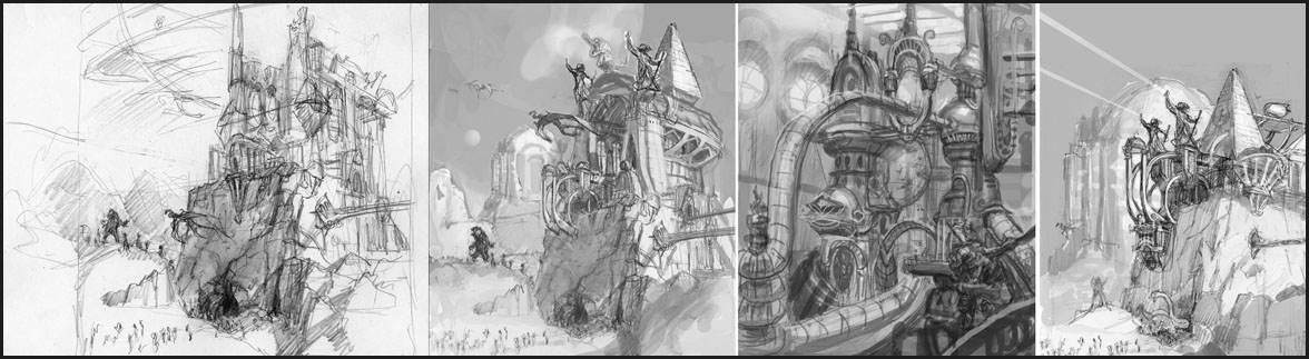
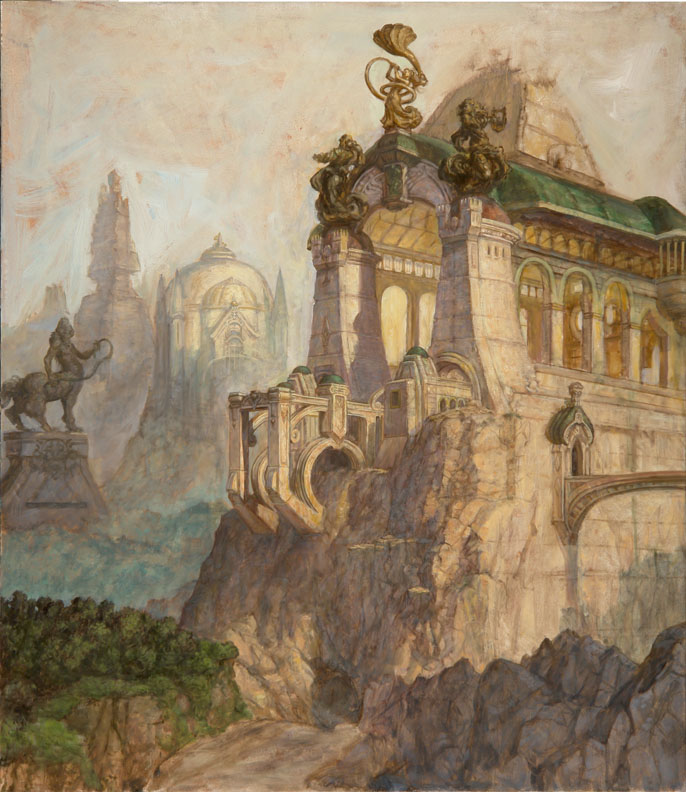
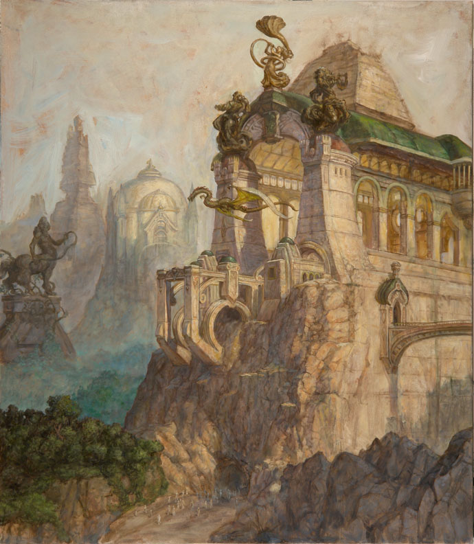
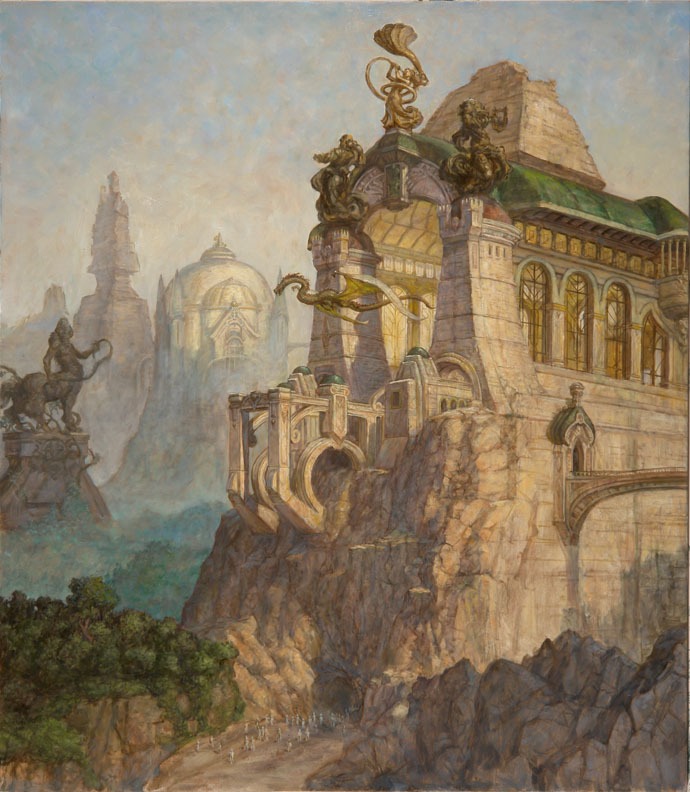
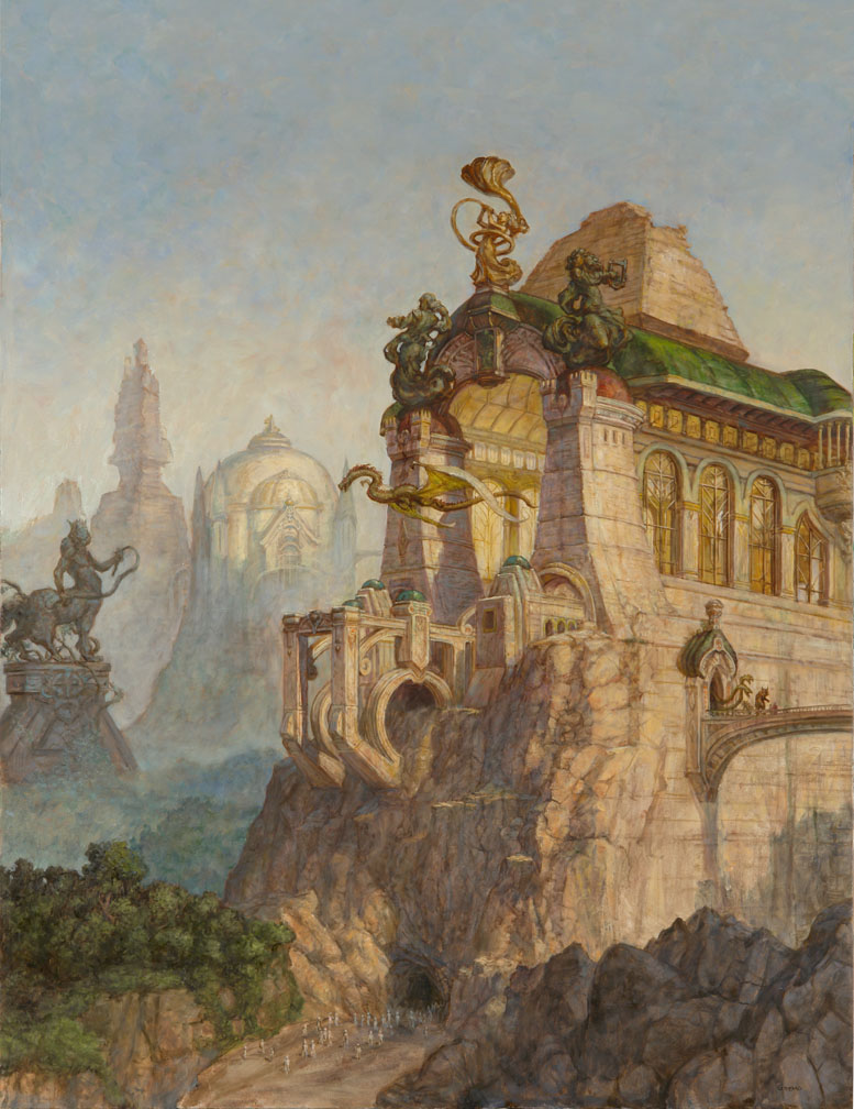
An anthology is a collection of stories. One way to represent this type of book is with cover featuring architecture and sculpture. It’s only a matter of placing the elements of the stories into a pleasing composition. The final painting should reflect an overall feeling of the book. In this case the feeling is of an ancient world of the future that is in decline. Feeling is important. As cold and static as architecture may seem as a subject it is very much a way to elicit an emotion and show drama.
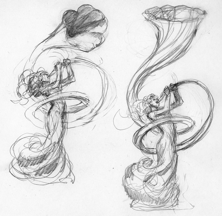
Ideas (above): Start with a feeling and work towards refining it with thumbnail sketches done with a pencil. This will be a landscape populated with classical looking architecture of our future’s past. As such it will be difficult for us to fathom. It will be a bit of a mystery. You can come up with your own idea of its function but keep in mind that time has removed many of the clues as to what that is. Thinking all of this out will help you come up with an interesting final idea. Scan all your ideas and then feel free to modify them using your computer. You can move and resize the elements till you’re happy with the results. A bit of cross-pollination between ideas is desirable.
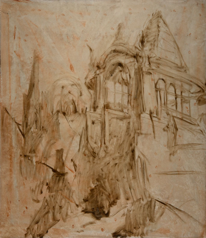
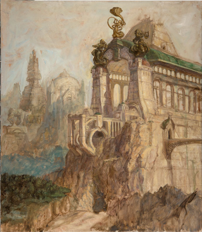
Throw on the Oil Paint . . . Figuratively (above): Once you’ve prepared a surface, in this case gessoed Masonite stained with a ground color, start laying in your shapes directly with paint. A large flat bristle brush is used to apply umbers (raw and burnt) but other colors like Mars violet are an excellent choice. If you’ve put down a very thin layer of linseed oil first on the surface it’ll make the applied paint a bit more fluid and allow you to easily wipe away to make your forms more intricate. Beyond getting your basic shapes down this should be a time to explore the idea further.
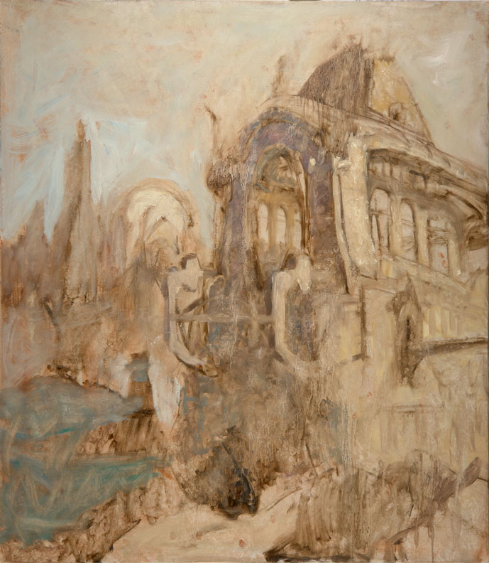
Throw on the Turpentine . . . Literally (above): While the basic lay in of umbers is still wet you can start adding opaque colors (Burnt sienna, Titanium white and Gold ochre) to represent the lit and shadow areas of the subject. This is supposed to be an aged structure. It’s not supposed to be a clean shiny new building. You want your paint to represent that and the paint is ready to do it if you give it a push. While the first two steps are still quiet wet dunk a brush in turpentine and splatter it on the painting. In that you already put down a thin layer of linseed oil as a start the turpentine will separate the paint and cause little veins and striations to appear as it runs down the painting.
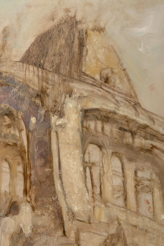
The Nature of Liquid a Close-up (above): The effect of the dripping is both the start of a texture for you and some inspiration for a direction to go in as you paint. In this case I want the turpentine to reflect a quality of aging the way time and weather, in particular rain, changes a building. This is also a way to get immediate natural details into a painting. It’s left to dry overnight.
Sculpting out the Details as You Go: It’s perfectly okay not to have a completely detailed plan before you begin painting. Some elements are best left fairly rough till later. These two drawings are a refinement of what I want the sculptures to look like. They’re left mighty rough though because, once you have the basic idea in your head, you can work out the details as you paint letting the paint lead the way.
Making it Less Drippy (above): As you paint over the painting it’s best to maintain the drippy texture where it’s needed. You’ll certainly lose some but keep what you can. The key here is to make the structure feel more solid and give it form while keeping the texture. Using your paint thinly and sable brights as brushes at this point is a good choice. Start this process with large brushes and work down to smaller ones. At this point a few lines are added as guides for perspective that, until now, was guessed at. Notice how I changed my mind on changing my mind on the structure and I have now brought it back closer to the original plan.
A Note on Texture (above): If you find that you’re losing textural character as you paint there are ways to put it back. You can drag your brush across the surface to leave bits of paint, you can scumble, you can press anything with a texture into the paint to lift off or add paint, you can roll your brush on its edge or you can use a malformed brush that applies paint unevenly. All of these approaches are used here often on top of one another. This detail shows all of these approaches.
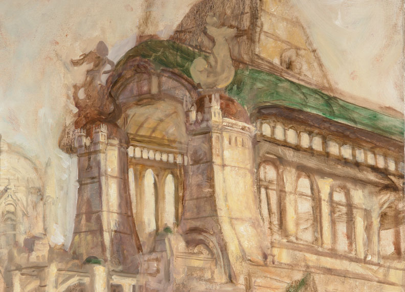
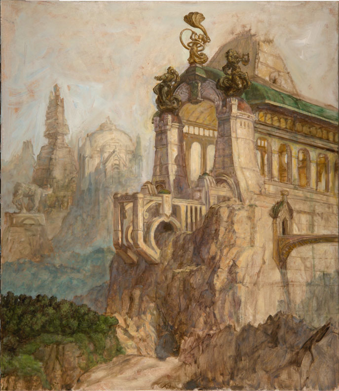
Define and Refine (above): A nice way of establishing your masses clearly is to take a painting only to a point you feel confident in them and then later refine them. Now some areas can be given greater attention and refinement. You can work out any area you’re not sure of first or an area you think will guide the rest of the painting. It’s still acceptable to experiment at this point. Touches of Viridian are glazed in areas to add color. The thinly applied green works well to simulate an aged copper roof because its translucency allows some of the underpainting show through. The inside of the structure, because it is largely composed of bounced light off of a warm surface is shifted towards orange more than the outside of the structure.
Light and Shadow (above): Light comes in from all three dimensions. This is easy to forget when you’re working on a flat surface. Although the light is clearly coming from the right side of the painting it’s also coming from a high angle from above as well. A change in the light’s axis will change the subject’s shadows, values and color so this all needs to be taken into account.
Once some of the smaller structural details are painted in additional shadows are added. Keep a keen eye on your architectural pieces for balance. Here the platform is widened to give balance. Even though you may have made up the figures for your sculptures you can study old outdoor sculptures (from life or from photographs) to imitate their textures and the way they reflect light. You’re mentally lifting a patina from them. It’s a bit tricky building the form and texture together because often one gets lost in another. You’ll need to find a equilibrium.
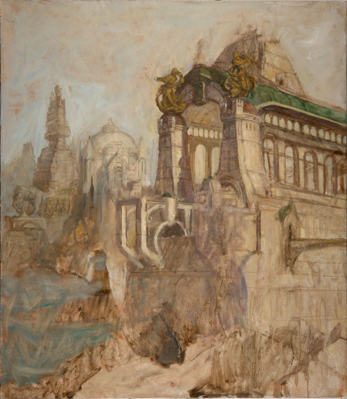
Back to the Drawing Board (above): Another sculpture is needed. You should try to paint it in directly but with a few quick thumbnails that take minutes you can test out your ideas and proceed with a bit more confidence. Notice how these are facing the wrong way. The sculpture was planned for another painting but it didn’t fit that one and flipped and place here instead.
Adding Details (above): The easiest way to add details like the center sculpture is to draw them in with paint. Thin down a neutral color with linseed oil and draw with it. You can easily wipe away your mistakes with a rag. Once the form is there you can add details to it. It’s best to always think ahead about what you’ll paint next in a painting. Some areas can be painted easily in one take but others are best laid in and then painted over again when it dries. Lush trees work best painted with dark leaves and shadows with highlights added later once they’re dry. That’s why they’re added in roughly before other details, to give them time to dry.
Inside Details (above): Any structure has an outside and an in. Here in this foreground structure you see a bit of both so you’ll need to picture both in your head even if all the details aren’t seen. Any imaginative painting requires that you mentally picture more than is seen. Typically it would make sense to paint all of the interior first and then the exterior. In that it’s mostly continuation of a repeating design it was left till now. Only the back wall had to be newly conceived. Because the large windows in the structure let in so much light the interior is aglow with warm light. Most of that light comes from what’s reflected off of the marble floor that can’t be seen at all. Your ability to imagine a scene logically comes into play here to give your picture verisimilitude.
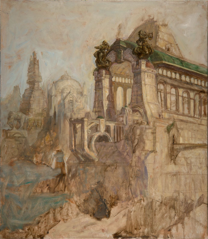
Making Adjustments (above): It's difficult to imagine a solid structure like this so it’s likely you’ll find your mind has wandered and now you find something physically impossible in your painting especially if you did it somewhat on the fly as it was done here. Don’t worry, just make a few adjustments, add an overlap or two and it’s all fixed. Note also that the sculpture in the background has been flipped to keep the eye from running off the picture. Also, the straight edge of the roof is off putting so I added a rounded dormer over a balcony to break the line. To make the shadows uniform and have a nice color shift from the lit area towards a cooler color a light semi-opaque glaze is painted into the shadows using Transparent white, Manganese blue and Ultramarine blue (all of these are transparent colors except the white which, despite its name, is actually translucent, i.e. semi-opaque). At present the sky is warmer than it will ultimately be so some of the new anticipated blue from the sky would make it into these shadows. Unfortunately, this change causes nice details to be softened too much so they’ll be added back in the next step.
Save the Little Details for Last (above): Now that the larger areas are painted you can add small, complicated elements to the painting, more detail in the trees and to the structures and tiny people are adding giving the scene greater scale. All of these are important elements of the stories as well that work together to make an interesting picture. The background is pushed back a bit with Manganese blue and Flake white. An intermediary layer is added between the foreground trees and the background so there isn’t a sudden falloff to the background. Oil paint isn’t perfectly opaque so it will take a second layer of paint so the background doesn’t show through the dragon. Even though light shows through its wings you still shouldn’t see any of the objects behind it.
Blue-Skying (above):
It might seem odd to save the sky for last but the advantage here is that you can use the sky to cut into all the objects giving them carefully controlled edges. Notice how the sky is duller towards its bottom. This is to give the picture a dusty dirty feeling. You’ll see this often in polluted areas of the country. Whatever the case the sky usually does this to some degree anyway. It’s never a perfect blue. Now that the sky is in it became apparent that the background needed to be even bluer. For the final, tiniest, details a #1 sable round is used, like for example, in the details of the crowd of naked people.
Traditional Meets Digital (above): After a few more final details it’s time to go digital. This is a book cover and therefore needs a bit more space on top for type. If it’s not done with physical paint you can always add it later digitally using a rubber stamp tool available in Photoshop. And there it is easy-peasy-lemon-squeezy.

Thursday, December 24, 2009

Winter Wonderland


This would be nicer as a printed card but time got away from me again this year. I hope there's a lot of it in 2010. Some years seem to have more in them than others.

These are the Thompson Ice Shelves with some holiday adornment. The thick ice shelves are left behind when the high tides recede. Then the ice slowly crumbles away without water underneath to support it. This is fun to watch especially during an aurora andrealis, or so Gnemo tells me. Here it is without the Christmas angels:

Labels:

Wednesday, April 15, 2009

CSI Art

This table of my art may appear briefly in an episode of CSI. It's on tomorrow on CBS, Thursday (4/16) at 9 PM EST. Here's the description of the show: CSI, A Space Oddity: Hodges and Wendy wind up investigating the death of a beloved artist when they run into each other at a science fiction convention for one of their favorite classic TV shows. That artist's name? -- Tom Kidd.

Okay, so I changed 'actor' to 'artist' and I lied about my untimely fictional death. I'm not the victim. Still, my art may be in it somewhere. I plan on making it a game, kind of like "Where's Waldo."

I don't know what those globes are. They're not mine. Maybe I'll find out tomorrow.

Oh, and I really should post more but work has me overwhelmed.

Saturday, February 14, 2009

Happy Valentine's Day Andrea!


I'm not one for public displays of affection but I'm making an exception today. It's seems to be the right time for it.

Tuesday, December 30, 2008

Regarding January 1, 2009:

Wednesday, November 26, 2008

A Tardy Illuxcon Report

I exhibited the painting above at Illuxcon. It’s a book cover for “Stonefather” by Orson Scott Card published by Subterranean Press. It’s a cleverly written story that has the feeling of a fable but with a gentle humor you wouldn’t expect. I got a chance to do a few pen & inks for this book as well. I looked it up and it seems the book is sold out already. Below is one of a few doodles I did at Illuxcon. I'm putting them between paragraphs:As far as I know I’ve always liked fantasy and science fiction. Over the years it has only gained in meaning for me. This is due to a greater appreciation for science and for literature. So at first when I heard of Illuxcon it seemed wrong to separate the art from the literature. After all I like keeping the science in the science fiction and I like to read.The thing that most appealed to me about Illuxcon was the chance to meet many artists I’ve never met before. And I did meet some but not as many as I would’ve liked to. Nonetheless, you can see a few pictures from that event on my photo-blog Shutterbuggy Kidd. I’m a bit strange in that it usually doesn’t occur to me to take a picture of someone unless they’re doing something interesting -- I need to be prompted.The idea of bringing artists and people interested in art together was a great success. Illuxcon was small in size but large in content and I think it will continue to grow in all directions.There were two highlights of the convention for me, one that I thought was funny and another that I thought was a lot of fun. The first night there was a small party and because so many people didn’t know each other the hosts suggested we write our names on stickers and wear them. Pretending to be an illiterate artist I drew an airship on mine. Well into the party a young woman was talking to my friend Omar Rayyan, looked at my name badge and exclaimed, “Are you Gnemo?!!” I felt a certain childish pride that I could be recognized by a drawing.The other thing I enjoyed greatly was doing demos with Michael Whelan, Bob Eggleton and Matt Stewart. That was a total blast. Above is a painting Michael started and I made something of a story around by making him or her embarrassed at being caught naked. Modesty does not become him. Below is a demon Michael started, Bob worked on and I turned into a painter I call “Bob.”And finally, below is a painting I call "Untamed Muse." I started this one and Michael worked on it.

Tuesday, November 18, 2008

Mater (an outsider's view)

Picture credits (my wife's family): Starting from the left, Mom (Debbie), Dad, (Hugh, he was very tall), Aaron (brother #2), Harlan (brother #1), Mater (step-grandmother), Sean (brother #3), Andrea (the oldest and smallest in her family at present day and love of my life), Pater (Granddad) and Erica (sister).

This is the first time I'm not posting my own art to my blog. My post today is dedicated to a woman called Mater.

My wife, Andrea, and I are back from New Hampshire. We went up there for a memorial service for her step grandmother Audrey Logan. She had recently turned 92. It was a long life, a much longer life than Andrea’s mother or father who’ve been dead for a few years. Andrea called her step grandmother Mater and has always thought of her as her grandmother with no ‘step’ attached to it. Andrea’s maternal grandmother had died before she was old enough to know her. She told me that she saw her Mater as an excitingly exotic woman of great vitality who did things no other grandparent she knew ever did. For one, she went to jail, not just overnight, but for six weeks, for protesting the Viet Nam War. For many years she protected her daughter as she went underground to hide from the FBI. Most of my family would’ve found that scandalous, certainly my own grandparents would have.

I’d met and talked to Mater a few times and I knew a little about her but I really never got to know her well. The main thing I knew was that she treated Andrea and her siblings very well. She went well beyond what you could expect any grandparent to do especially for children that did not come from her own children. Andrea spoke very fondly of her visits to her grandparent’s farm. Anyone who is or was nice to Andrea is my instant friend so I already liked Mater before I met her. Almost all grandparents are nice to their grandkids but Mater was the type of person who changed lives for the better. At Mater’s well-attended memorial it was moving to hear testimonial after testimonial from people she had helped with her generosity of time and money, people of distant places and religions that held her in high regard. Beyond that I could see what she had instilled in the people there. Their memories of her were rich and fulfilling for them and I could sense her presence in them. They had learned from her. This was a Quaker service where people sit in a circle and stand to speak when they feel moved to. I liked this and I told Andrea that this is the service I want when I die, certainly not one with a minister giving a hackneyed sermon.

After the memorial, at a rather large family dinner I heard even more stories about Mater. My wife’s extended family was warm and generous just like their mother, grandmother, great grandmother and friend. The people there laughed and sang songs from their childhoods. It was a contrasting prelude to a cold Sunday burial, a sad time of letting go. And I remembered one of my rare conversations with Mater when I told her how happy I was to be a part of her extraordinary family.

The amazing thing I came away with from this trip was a picture of Andrea younger than 18 (she’s around 13 in the picture I think). Almost all her family photographs were destroyed in a basement flood. In the picture she’s with her entire family including her Mater and Pater. No other complete family picture exists. See above.

By the way, Andrea’s grandfather was no slouch either. He was a Rhodes Scholar, well-known editor at Look Magazine, vice president at General Foods and he was the Republican majority leader in the New Hampshire senate, but not all at once.
Thursday, November 06, 2008

Pen & Ink for Songs of Dying Earth


I'm rushing around today (as I have been all week) but I wanted to put up a quick new post. This is one of 19 pen & inks I did for "Songs of Dying Earth" an anthology of stories written around a world, a far future earth, created by Jack Vance. The book is sure to sell out.

Thursday, October 30, 2008

Happy Halloween: Number Two of Two

As promised, above is the book cover for the anthology "Witch Way to the Mall" edited by Esther Friesner. I like painting silly and grotesque stuff. The editor wanted a sexy soccer mom type witch though (a WMILF?). Can you find the Wizard of Oz allusion? I did it entirely subconsciously. (Hint: a means of propulsion, although not usually a desired one.)

Below is one of my initial thumbnail ideas and three bonus, more traditional, witches I painted for "Wyrd Sisters" by Terry Pratchett many years ago.


Now to go and eat the candy I bought for the Trick-or-Treaters. They're going to be egg-throwing angry with me.

Sunday, October 26, 2008

Happy Halloween: Number One of Two


The more I paint the more I want to draw. The more I draw the more I want to paint. Then there's inking. I love to work in pen & ink. You can get so much out of a line. It's spooky -- BOO!

I know that's pretty lame but that's what Halloween is all about, bad puns and being horrifically unfunny. The pen & ink above is a frontispiece for an anthology called "Witch Way to the Mall" edited by Esther Friesner. (See what I mean about puns). I'll post the cover for the book later, nearer to Halloween.

I've added a new blog to my blog links. It's The Bastion: Web Journal of Fantasy Author John Marco. He asked me to do a guest blog and doing it reminded me how much I liked doing my own blog. Thank you John. John has a new book coming out I did a wraparound cover to called "Starfinder." I'll post it here at some point but if you want to see it sooner you can click on the link to John's blog. You'll need to scroll down when you get to his blog though.

Monday, October 20, 2008

Long Shadows of Introspection


Last week I completed several projects that kept me happily busy. Is work really its own reward or is it a way to escape unproductive pondering?

Quite often when I complete a great deal of work and the pressure of looming deadlines is lifted I like to sit in a dimly lit room and do nothing. This can last a couple of days. My wife finds my behavior unnerving. This time though I was filled with energy and I quickly went about doing all the little things that I couldn’t do when I was busy. That lasted about three days and then I started brooding so I went out for a long walk. I’m not sure how many miles I traveled but my walk lasted for hours. Heck, it’s two miles into town alone. I decided to look at homes for sale in town. If the right one presented itself I’d buy it and turn it into a studio. It’s a good time to buy. Prices are low. A few years ago I considered buying a small church. What a great studio that would’ve made with its vaulted ceiling. I’d have to have a contractor take off the giant white cross though. All these ideas are completely impractical yet I continue to entertain them. Maybe, just maybe . . . well, I wouldn’t want to miss a great opportunity, would I? (See how my brain works).

The long walk didn’t work though. Today was worse than yesterday. I dragged myself through the day. I did some organizing and some cleaning. It depressed me further. I kept running across disheartening things.

Around four o’clock I went for a run. It was colder than I expected so I had to change my usual path so I’d be running in the sun. As I saw my long shadow ahead of me I thought about what I wanted to do with my future and I decided to start my blog back up.

The picture above was done for Subterranean Press. It’s the cover to an anthology called "Songs of Dying Earth" and I did several pen & ink illustrations for it as well that I will someday post to this blog. I greatly enjoyed reading every story in the book. The reason I put it up on my blog today is that it fit my mood but that mood is gone. I ran away my long shadowy thoughts.

Friday, December 28, 2007

The Reindeer Express Corporation

For legal porpoises, by which I do mean the sea mammal, I wasn’t able to release these phony stocks and their associated company bookmarks until after Christmas. Either that or I’m terribly behind. If all goes well, I’ll actually print all of this out and send it to the people on my list.


In the meantime, I’ll describe this new never-to-make-a-profit/non prophet (no sense of the future) company: Earlier this year we acquired the rights to Santa & Co., a poorly financed, frivolously managed and inefficiently performing sole proprietorship. We’ve spent the last year revamping and updating that system and today we’re announcing the launch of new company, Reindeer Express LLC. Reindeer Express is now the only company to ship exclusively on Christmas Eve. We use a multitude of airships, blimps, airplanes and, of course, winged reindeer (as seen in our official bookmark) all working in concert to accomplish this. Our management will take this company in a very positive re-architected direction. 2008 will mark our entry into this new technology platform and management is very optimistic that it will be a tremendous year of growth, even including increased elf size if not jolly-man girth.


The above is an authentic faux replica of a fake stock certificate. Feel free to print yourself out a copy.

And please take a look at "Don't Feed the Howndders" on Gnemo's Sketchbook.

Tuesday, December 04, 2007

Then and Now


I like to imagine that the above picture was painted then time and progress happened and the scene below was painted. (Go over to Gnemo's Sketchbook for a new post too.


Here's the full story of Doré Volcanoes:

Living at the edge of instant death, but with limitless steam energy to run their factories, the Valcodians live every day knowing it could easily bring molten death. They work on a rotating schedule with half their life spent at serious toil, and the other half spent in hedonistic abandon. Hundreds of years may go by before one of the ring of volcanoes in their community erupts, and obliterates an outpost. However, they are all keenly aware of the dangerous business they are in. Constant monitoring of the volcano, and a quick escape route that takes the populous behind some distant rock has on occasion saved lives, but is usually futile.

Sunday, November 11, 2007

Dumbstruck!

Something very cool happened to me. This past weekend (Nov. 8-11) was The World Fantasy Convention. I attended it as an exhibitor.

The first fantastic thing to happen was that I met Moebius, that is the pseudonym for Jean Giraud the great French artist, concept designer and comic genius. We talked briefly but I didn't want to monopolize his time because everyone wanted to meet and talk to him. This was, after all, during the artists' reception at the art exhibit.

The next thing to happen was unbelievable and highly improbable. Mr. Giraud bought a painting of mine. He told me himself and I was dumbstruck. Truly speechless.


The painting above is now in Jean Giraud's house in Paris. I've posted it before but I thought I'd put up a newer larger scan of it.


I did the drawing above last Friday for fun and it came out looking a little like a female Arzach, one of Moebius' male characters, so I took it more in that direction. Clearly I was still thinking about that meeting. She's not wearing Arzach's archetypal hat. It's been replaced by hair of similar proportions, kind of Marge Simpson-esque. The last thing I added to this was Arzach's own winged transport to make the homage clear.

I wonder how much of a sycophant I'd be if I packed that picture up and sent it off to the artist that subconsciously then consciously inspired it?

Oh, and here is proof that I met him, a picture of me, Omar Rayyan, an artist friend you should see the work of, and Jean Giraud (Moebius) himself (below).


Picture by Sheila Rayyan (Also a spectacular artist. You can see her work on the Rayyan link as well).