Petrogypsies

I got tired of seeing my face, especially when I leave a comment on another blog so I'm using this guy's face. All the other artists use art for their picture so who am I to buck the trend?
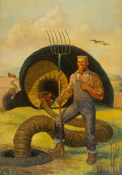
This book cover is one of the few paintings that I've always thought of as a success but has never been a fan favorite. It's old . . . 1987. Whenever anyone sees it they exclaim, "What the hell is that?!!!" referring to the worm creature. That's just the reaction I wanted.
Sadly, I got a lot of negative comments about it, like the pitchfork having too many tines. If you're going to make a comment about farm equipment I say you should put in the research and learn the difference between a pitchfork and a hey fork. Furthermore, I heard that the author of the book hated the cover. An editor later told me that the author imagined a different cover altogether that, to add to my frustration, matched exactly the one sketch I did that the art director hated. The art director wanted something much more silly and that's what I gave him. Maybe I pushed things too far with the sphincter-like quality to the worm's mouth. Hmm, maybe I should've used that for my picture; people sometimes tell me that I can be an ass.
Oh, and that giant black worm thing, it sucks oil from the ground. It's a living oil drill.


7 Comments:
I like it. Especially the sphincter looking worm oil drill. Nice piece, art directors screw up most of the good art in the world.
It's a very impressive painting... And also very strange... Maybe it's the big smile on the farmer lips, or the worm, or the whole composition, I don't know, but there is a special mood, a little absurd... Oddly, I think about K. Dick's novels seeing that...
Fantastic painting! It has a real classical feel to it color-wise. That's pretty funny that the author hated it. Makes me like it even more.
hmm- i posted something before, but my comment didn't come through. In a nutshell - I like it!
I think that this was the cover to this author's first book so he was especially sensitive about it. He was never so impolite to complain to me about it. The book was actually quite good. I read them all.
Hey, Tom -- Wow. I don't think we've chatted before.
Actually, I didn't hate it at all. It was, however, totaly unlike what was in my mind. And it's kinda grown on me in the intervening years.
I REALLY like the way Henry Lee looks, but I saw Sprocket (the giant worm-thing) much differently. Bigger cockadactyls on the background would have rocked also.
And I have no idea who would have snitched me off about this anyhow. I deny everything.
Uh....That said.... do you by any chance have that other version of the cover buried in a trunk someplace?....
I'm glad the book didn't hurt to read. Like so many other first novels, it got some good reviews in the genre press, then quickly vanished.
And -- I'm flattered that you're using Henry Lee in your sig, for however long you do it.
Baen didn't take the proposal for the sequel to 'Petrogypsies', I wandered away from writing for resons too long to talk about here, but am this past year getting back into it.
I blog with some other writer-types at www.eatourbrains.com, and would be delighted if you would give me permission to link to this entyr in your blog, and/or use the 'Petrogypsies' cover at some point on our blog.
Take care,
Rory
**********
Incidentally, and not to suck up or anything -- I liked the too-many tines. Alternate reality and all, y'know.
Post a Comment
<< Home