Does This Seem Too Dark to You?
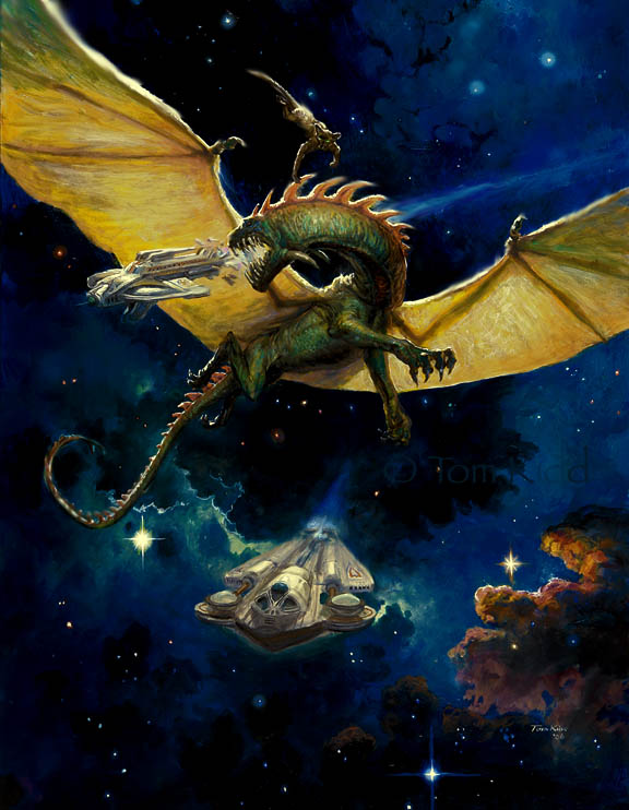
I did this book cover a few weeks ago but now seemed like a good time to post it. It's for a book called "When the People Fell." Just now I adjusted the color some and I think I like it better but maybe it's too dark now.
An odd thing happens to me when I do an illustration, as opposed to something for myself, I don't have much to say about it. The book was very good and very strange. If you've not read anything by Cordwainer Smith I'd pick it up but it probably won't be out for awhile.
posted by Tom Kidd at 5:05 PM
![]()
![]()


3 Comments:
Looks good in my monitor, Tom. The blues are deep and rich, work beautifully with the light coming through the dragon's wings. Nice sense of scale and depth too.
I agree with mark reep, Tom. Overall it's not too dark at all. However, I think if you added some internal or running lights to both ships, it might provide a little something to the piece.
However, you could leave it as is, and it would still stand well. Happy New Year's to you and yours.
I think it looks great. I gave the ole' 'squint test' to see if the values held up, and they do. Just that great shape of the dragon wings against the dark background works really well from any distance. Man -dragons in space in the future - sounds crazy!
Happy New Year - looking forward to more of your magic this upcoming year.
Post a Comment
<< Home