Thursday, September 28, 2006

Gnemo’s Sketchbook

I can draw or paint anything that’s in my head. If it’s not that clear I’ll eventually work it out. Getting a particular tool, especially if that tool is a computer program, to make what’s in my head can be very difficult for me. I’m starting something today that’s not quite what I had in mind -- literally not quite the picture within my brain. This new web log is called ‘Gnemo’s Sketchbook.’ See link above.

My hope is that I’ll solve some technical problems as I go and determine an approach that I like best. Expect this to evolve. The art on this new blog is presumably all scanned from Gnemo’s sketchbooks. I want it to look like it has been carried around for many years. My other hope in doing this is that I’ll get some feedback on design and technical issues.

Presenting this story in this form is a way that I can develop it further in a manner that forces me to do regular updates. I have a problem with being regular, that is being consistent. All the work that will go up on this blog will be monochromatic but if it is ever printed it’ll be mostly in color in the form of watercolors. This will be just one form that I’ll present Gnemo in. There is also a version with full-scale oil paintings. I think that Gnemo is a sufficiently large story with enough depth to handle all these different forms.

Saturday, September 23, 2006

The How, Why and Why Not?

As a child I was always curious why things are the way they are. I’ve always been frustrated by people telling me that ‘that’s just the way it is’ or ‘that’s just how it’s done.’ ‘Don’t ask why,’ they insist, ‘just use the formula’ they say and ‘they’ too often are teachers. If a kid (or Kidd) wants to have a deeper understanding of something he or she should be allowed to explore it. Okay, when I’m under the gun, I need to know how to get something done and following the established method is the sure way but it’s not a good way to learn. If I know why something is a particular way and I know how a bit of knowledge was derived it is much more helpful in understanding the reason for something. This gives me the ability to expand on a concept. You have to be thinking, what does this have to do with art? It’s not so much about art as it is about how I make art.

My way to make pictures is to understand the world around me as well as I can. In particular I want to understand the pattern, the underlying force(s) that make(s) up the universe. I wander right into specialties that I’m told I have no business in. ‘Hey, this is our area of expertise,’ the experts tell me, ‘go back to your studio and make paintings.’ To see the world with greater accuracy you’ll need to know a great deal about it and you’ll need to use your imagination too. Two things artists and scientists have in common is that they both have to be very good observers and they both have to use their imaginations -- our senses don’t sense all. It’s a great thing to be able to picture things in your head well: to know the weight, to feel the density, to see the shape, to know the internal anatomy, to imagine the reflective property, to see something from many different perspectives, to feel the texture, to understand how your eyes take in light, to mentally adjust the light and all its qualities to fit your needs. This knowledge will give someone imaginative power on a grand scale. Omnipotence!

At the end of the day I still have to have done a nice painting though. I can’t have a career without that, well, not for long. A great number of artists seem to be able to create without having a deeper meaning, at least not consciously, of their subject. I’m sure I can to, but then the work would have less meaning for me. It’s also less fun that way.

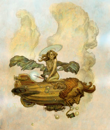
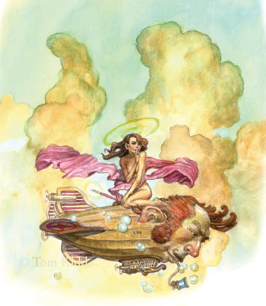
Now, what does any of this have to do with the drawing I’ve posted today? Nothing. Not much of anything, that is unless you count the title of this piece, “Omnipotence.”


Maybe this picture is more about the next step after making light in creating the universe. The subtitle could be “Let there be art.”

Thursday, September 21, 2006

Medium Matters

The examples below show two approaches: one digital, one traditional. Because they’re the same subject matter I think it’s interesting to compare the two. I did a number of chapter headings last year using the multiply layers in Photoshop to make a color picture out of a drawing. It’s very similar to the way you’d work in watercolors. The layers are transparent so they work like glazes. I started out with a drawing I’d scanned, made a layer and started coloring on it. Then I made more layers, colored them, made more and so on.


My theory about working with Photoshop is that it reflects your character in a pure way. I can easily recognize the work of an artist whether he’s working traditional or digital. Mediums like watercolor, oil, acrylics, and tempera all have a personality of their own. When I work with Photoshop I’ve notice my work has no character. Thus, I can conclude that deep down in my soul I’m empty. That’s why I cheat. Over the years I’ve scanned the texture stage of my paintings. I’m just not that fond of smooth so I usually start my pictures out with some sort of visual/physical texture. It’s these textures I use to add faux character to my digital work. I’ve saved these textures using define pattern and I use the pattern stamp tool to paint with using a variety of saved textures. Pretty cool, eh?


Working like this was fun for a while, then I started pining for real paint. It had been a long time since I worked with watercolor so I asked my watercolor friends for advice. They were very helpful. Artists, for the most part, are quite open with information. It’s their time that they are more careful about giving away too freely. An artist’s time belongs to his or her studio. Being a timid fellow I decided to do my first watercolor in 25 years of something I’d already done digitally. The great thing about watercolor is that it has its own character. If you let it go its own way it does some neat tricks. Since this first watercolor I’ve done several more and I have plans for a great deal more. Watercolor has the soul I lack. It must be so because I’ve been told that eating the right colors, for example the cadmiums, will take you to heaven.

PS: An exhibit of my work is coming up. I'll have the information soon.

Wednesday, September 20, 2006

Life Price

These last few days have been frustrating. I’ve been trying to resolve some technical problems and too much of my time has been eaten up. Why does improvement have to take a piece of your life? I didn’t expect a life price.

Thinking that all my problems were behind me I happily began painting at about four today. My job is easier and much more satisfying than every day life. I think that I’m bad at life. Sadly no one will run mine for me. I’m forced to do it myself. Here’s what’s irritating me -- I now feel a cold coming on and just when I was getting to the fun stuff. Thanks for sapping my energy Mr. Virus.

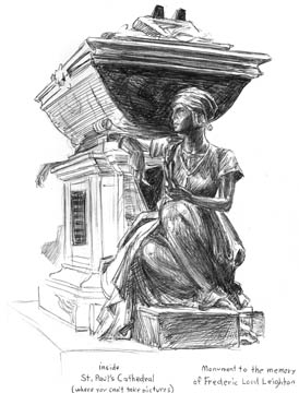
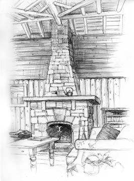
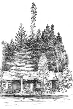
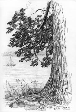
Here’s my lazy post for today. It’s a few drawings I did on two different vacations a few years ago. One was done in London at St. Paul’s Cathedral of the famous painter/sculptor, Lord Leighton’s monument, and the rest were done on a trip to Canada at a resort. All of these are ballpoint pen sketches. I like the amount of contrast you can get with this medium. It’s slow going when you try to capture values though. Sometimes it’s good to augment it with some watercolor for subtle tones. I’m a purist at heart so I don’t usually do that.


Monday, September 18, 2006

Nice People

Most people are very nice to me. This may be because I abhor mean people so I don’t spend much time with them. In a somewhat self-centered way my brain on its own has put the people I know into either the good or bad column. The kindest people are those that care about me and express it by listening to my woes without complaint. Also included are those people who have helped me in some way, small or large, without me asking them to. Finally, the list includes people I see doing nice things for other people I know and like. All of this makes me indebted to a large number of people. I’ll never be able to return all the many kindnesses. Maybe I should try to cultivate lesser quality friends.

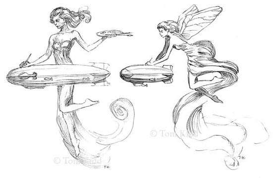
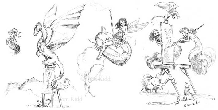
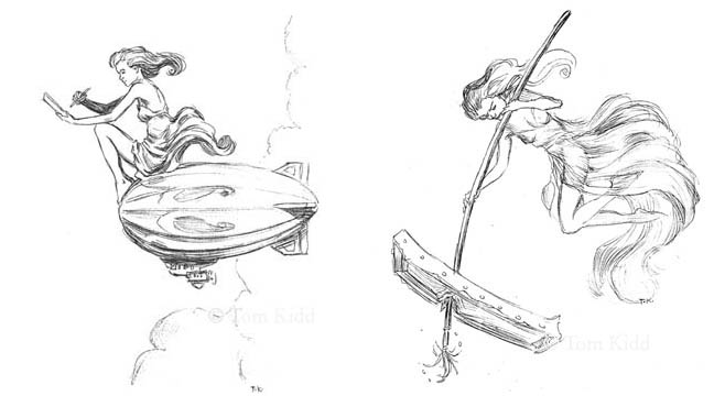
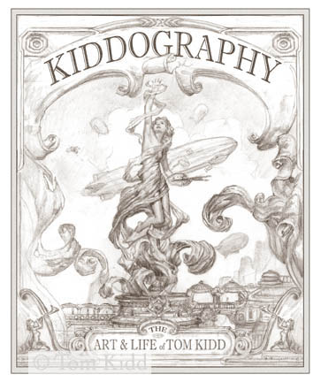
So when my book Kiddography came out I bought a substantial number of them with the intention of giving a lot of them away. This would be a small way to say thank you to some people. In each copy I gave away I did a unique drawing. Months later I’m still drawing in them. I also did drawings in a number of the books and sold them at a premium price. A few friends picked up the book and sent me their copies to sign but I’m doing a drawing for them too. As tiring at times as it has been, I’ve actually come up with a few ideas I like and am likely to turn into paintings or watercolors. The group I’m putting up today have been crammed together two to three on the page and the theme is fairy painters. All these were scanned from photocopies so they’re not the best quality.


Saturday, September 16, 2006

Forgotten Sketch

A lot fewer words. It's too nice a day to be blogging. I forgot to include this in my Thursday, September 14th post. It goes with everything else.

Friday, September 15, 2006

The Naked Change

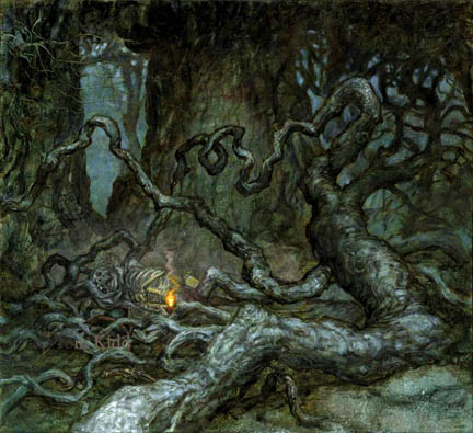
I promised in my previous day’s entry that I’d put up a painting that I’ve changed substantially. Here’s the before. It’s an illustration I did for “Realms of Fantasy Magazine” for a story by Tanith Lee called “En Forêt Noire.”


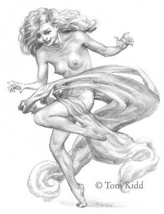
Once I turn in an illustration I can do what I like with it. It’s rarely in my plans to do anything with a finished illustration but once it sits around for a little while I start seeing more to it. Months went by on this one. During that time, as I always do, I did a lot of drawings to entertain myself. Even though I’m not really known for my nudes quite often I’m drawing naked people. It may be a habit left over from art school, it’s certainly a subject that artists should always be studious about or it may simply be that I like naked ladies.

All these pictures come out of my head and go onto the paper through a pencil that I have in my hand. Sometimes my hand seems to be the thing that really has the pictures in it because I don’t always know what I’m going to draw. It’s truly entertaining when I can surprise myself.

Finally getting to my point, I drew the picture below. It’s part of a series of drawings I’ve done of nude women with flowing forms around them. If you go to my website you can see several newer drawings I’ve done. Look in the ‘Drawings for Sale’ section for the newest stuff. They all have silly little captions.


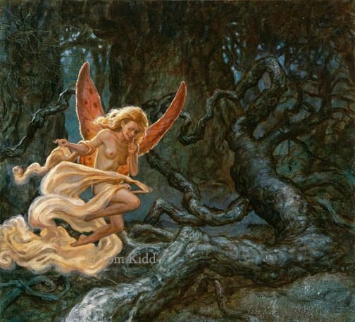
I decided that it’d be nice to put the nude into the painting I’d done for Realms. It’s not that easy though to just insert something like that so I did a few more sketches till I felt I had something that worked well. Without drawing on the painting I painted in the nude directly. Oil paint is a bigger friend to you than the pencil is. It usually shows you the way and if you have a misstep it will happily forgive you. Love your paint and it’ll love you back. Never ever fight with it – you’ll lose.

Below you can see how the two pictures were squeezed together. The title of the new painting is “Stealing Blame.” I exhibited this painting in Anaheim at the World SF Convention and I sold it there.

Thursday, September 14, 2006

Leave Well Enough Alone? Hardly!

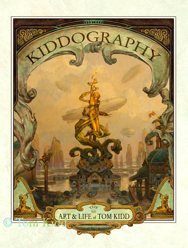
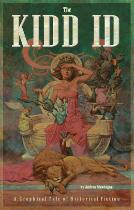
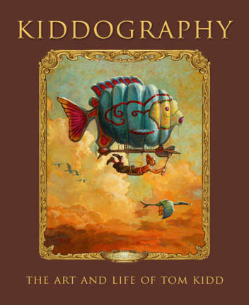
Back when I was working on my book “Kiddography” I decided I’d do a new painting just for the cover of the book. Each night, after a long day of writing and laying out the book as well as doing in my regular work, I sat down and did idea drawings for the cover. When I had a few of them I sent them out to friends with this question: Does this reflect my personality? My very nice friends kindly told me none of them were quintessentially me so I went back to the drawing board and did something I liked. I then went to painting it without further input. Trouble ensued. The Quark file for my book became corrupted and, without knowing it, I saved the corrupted version. I know ways to prevent this now, but I didn’t know it then so I had to redo 50 pages of work. This put me terribly behind. Paper Tiger wanted to see the painting and it wasn’t done. I sent it to them partially finished and I told them it was incomplete/in progress. About a week later they told me, after showing it around, that they were going with something different because that painting looked . . . “unfinished.” Pretty funny eh? Here’s what the cover to “Kiddography” would’ve looked like had they liked it.


Just for fun, here is another cover that was done with a very different concept for my book in mind. They rejected everything about this.


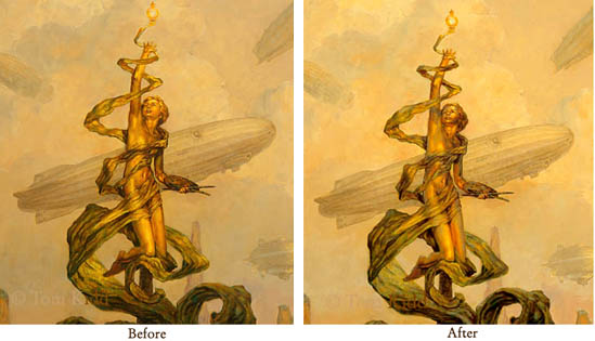
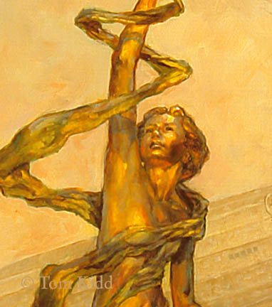
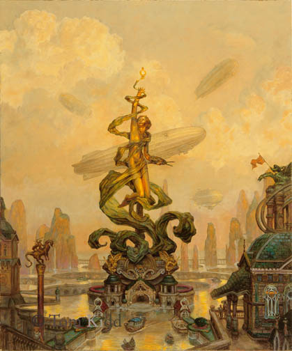
Yesterday I changed the painting. I’d been planning to for some time because of a trip to Montreal. There I saw a gold statue in the warm morning light. Looking at it I said, wow, that’s how it’s done. I could see how the gold picked up more of the ambient light from the sky than I’d expected and how much more orange the reflected light into shadow was than I’d thought it would be. At the time I originally did the painting that level of color contrast seemed garish but when I compared the painting to the photograph I took of gold statue at the right time of day I felt I had to make a change. Here’s a close-up of that with a before close-up. It’s not quite there yet; maybe I made a mistake; I hope that I learned something. Take my word for it, the original looks better than this little jepg.


Here’s another even closer shot of it to compare.


I also changed the entire painting in other little ways but probably nothing you can see here.


By the way, this is what the cover to Kiddography really looks like.


The next painting I put up that I’ve changed will be quite a bit different from the first version. Here I was just testing a principle, perhaps at the expense of a painting.

Wednesday, September 13, 2006

Evolution of an Idea

I was going to put up a painting that I made some changes to today, but a couple of hours ago I received a copy of “Drawing & Painting Fantasy Landscapes & Cityscapes” by Rob Alexander. Rob did an excellent job with the book and it looks great. I love Rob’s work and I was honored that he asked me to contribute to his book. They chose two paintings of mine to do step-by-steps for. As always I went overboard with my text, and I can see that it really doesn’t fit the tone of the book. Of course, I couldn’t know the exact tone of the book. I tend to be me when I write and that would’ve been a sin – it would’ve been different. If you want to be successful don’t be different, unless you’re already real popular. (I’m paraphrasing Homer Simpson here.)

Because I have this very new thing -- new for me -- called a blog, I’m copying my original text for one of the paintings in this book, “Winsor McCay City.” I’m also putting in all the step-by-step illustrations in the book plus a couple more. Know that in the book the illustrations are much bigger, nicely reproduced and you really should buy it. Also, don’t tell Quarto I did this. They might not like it. Shhh!!

Evolution of an Idea:

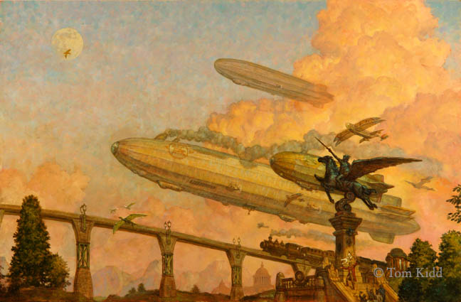
I feel a tug of melancholy when I think about "Winsor McCay City" because it was done back in a past when it seemed I had plenty of time for my ambitious plans. It was made before computers were common in making art. Although my memory has faded some I’ve carefully retraced my steps. You’ll see how my ideas all came together. I don’t work this way anymore. Perhaps I should.

It all began (fill in mysterious music here, some blurring and fading around the corners, and picture me looking thoughtfully off into the distance) back one day in1986 when I went into New York City to deliver a book cover. I rode in on the bus, and as it went through the center of Manhattan I saw a 19th Century building called the Ansonia and I imagined an earlier New York and riding into the city, not in a bus, but an airship. When I got home I did what I call a mnemonic study. It didn’t look exactly like what I saw, but it was the germ of an idea (see ill. #1). It was one of many. You should know that all of this fits nicely into a story and a place that I’d imagined several years before. It’s called Gnemo and I’ve done hundreds of pictures for it now.


It’s not uncommon for me to start with a pretty small idea and expand and expand and expand. After this drawing I did several little thumbnails (small scribbles) and I ultimately came up with a composition I liked (see ill. #2). I believe that great illustrators are great because they make the right decisions as their work progresses. Here you will learn from my mistakes. As I did in those days I drew the entire picture to the full scale of the painting on tracing paper. This is a good way to work out the kinks in your drawing. Then I transferred the drawing to gessoed Masonite with carbon paper.


The full drawing in this case isn’t substantially different than my initial sketch, so I’m just showing a section of it (ill. # 3). Once I transferred over the drawing, I toned the surface with a wash of burnt sienna. This seals the drawing (doing this sometimes smears the drawing a little, but that’s not something to worry about; you can always refer back to the drawing on paper) and gives you a nice color to work over. Then I began painting. In short order I realized that I didn’t like it. It needed to be more spectacular. This painting should be an eighth wonder of the world experience.


I did a few thumbnails and chose one (see ill. #4). The basic idea was good. Like a castle I imagined that the main structure grew over time. My composition needed an even more important center of interest. It needed to be monumental, ridiculously so.


I pulled out a sheet of tracing paper and I put it over that drawing and I drew how I thought this structure would be added to and expand over time (see ill. #5). This painting would be my first real architectural piece, not to mention my second Gnemo painting. It took me a long time to work out just what I wanted. Once satisfied, I transferred over that drawing and started the painting anew.


From start to finish this painting took quite awhile. I did it between my regular illustration work and sometimes a couple of weeks went by before I could return to it. A friend of mine suggested I mix my colors ahead of time and submerge the pallet in water in-between to keep the paint wet. It worked, but I’ve never returned to that method. One advantage it gave me is that I basically laid in a texture, without form, into the shape of the buildings and added the shadows and form later in a series of translucent glazes. Then I could go back with the wet paint off my pallet to add, for example, the little filigrees in the windows. This also allowed me to skip doing a color sketch and work out the colors of the painting in a somewhat rough manner before proceeding to the time consuming details. I discovered that I could create a simple tonal shape and just keep building on that. These details should help illustrate a little of what I mean (ill. #6 thru #8). If you look very closely you can see how I first painted simple shapes and then added details on top of details.


Here is the finished painting (ill. #9). Note the difference between it and the next illustration (#10), you'll have to look real close. I decided the structure needed more wall on the left to balance out the building.
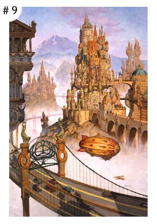


If I could go back and work on this painting I would put a sculpture in the foreground similar to the one you see in my sketch. I would also correct the design of the suspension bridge so that, if built, it would be a structurally stable design. Using my computer, one day I may just do all that.

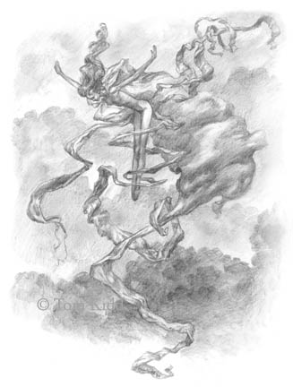
Note: Illustrations #11 through #14 are just a few extra close-ups of my full drawing I traced over.


Tuesday, September 12, 2006

Four Dimensional Composition

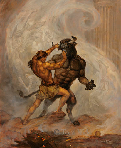
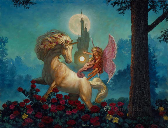
I was looking at a couple of paintings of mine that are hanging in my bedroom and I noticed a compositional similarity. They both have a V-Twist to them. I’m posting them here for you to see: “Theseus” (16X20, 2005) was done for a series of Greek mythology books for Carus Publishing by Geraldine McCaughrean. The next painting “Unicorn and Fairy” (21X27, 1999) was done for Franklin Mint for one of their plates. The plate was never made and I spent some extra time working on this painting and adding to it. That’s why it is no longer in a circular format. I’d planned from the beginning to do this, so I left space to expand.


Looking at them made me think that the way I compose has four dimensions. Of course there’s up, down, right and left, the two dimensions of the physical surface and then there’s the added illusion of three dimensions. So what’s the fourth dimension? It is movement. Time is thought of as the fourth dimension and without time there’s no movement. Suggested and implied movement is important in a composition. I know all of this, but I sometimes I don’t know I’ve done it till later. Another day I’ll put up some examples of paintings that have different types of visual layers, yet another important part of composition.

Labels:

Monday, September 11, 2006

New, Old, Sold

I’ve decided to post something as close to once a day as I can. Today I have three pictures that are not on my website. The category today is something new, something old and something sold.


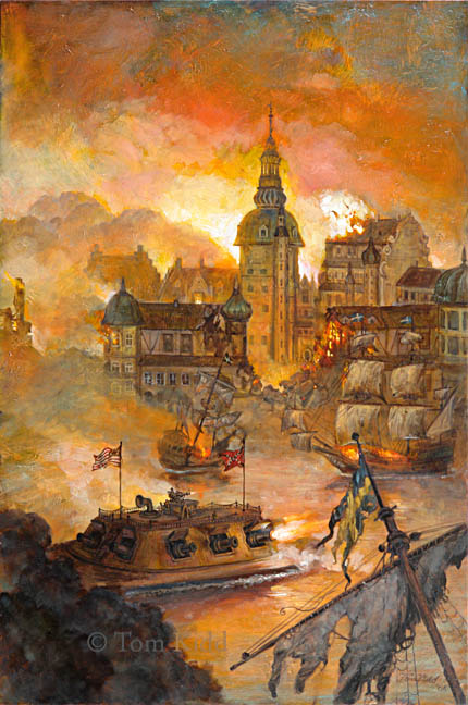
The first I finished just last month. It was done for "1634: The Baltic War" by Eric Flint (16X24) 2006. I tried my best with this painting to be bold. At the very least it is quite thick with paint. The ironclads are the anachronistic element, important in all alternate history.


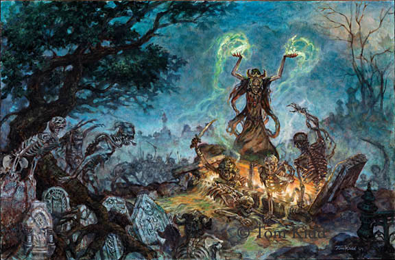
"Libris Mortis: The Book of the Undead" (16X24) 2004 is the only thing I think I’ve done for Wizards of the Coast. You can see a better copy of it in my book "Kiddography." People seem to be genuinely scared of this painting. To me it’s a bit too much of a caricature to be truly upsetting. The necromancer is a bit on the orgasmic side of happy.


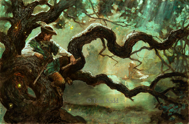
Just today Irene Gallo, art director at Tor Books, asked to put up an illustration on her blog that I did for Realms of Fantasy for "Robin of the Green" (2006) by A. C. Wise. I painted this right after I saw an exhibit at the Dahesh Museum of the Kelley Collection called “Stories to Tell.” This exhibit was of work from the Golden Age of Illustration or of artists from around that time: Wyeth, Pyle, Schoonover, Dunn, Leyendecker, etc. As I worked on this painting I tried to channel those illustrators. I felt I fell a little short of my intentions and, I think, undervalued the painting – literally – selling it for a pittance.

Labels:

Sunday, September 10, 2006

Newer Paintings

I did this painting originally for DAW Books as a cover to Fitzpatrick's War by Theodore Judson. About three weeks ago I put it back on my easel and this is the result. The painting is 32 X 21 and it was done in oils. It's been retitled Abbey Air Race.


Last month I went to the World SF Convention in Anaheim. It was a good show for me. I met a lot of very nice friendly people, very few of whom I remember. These things are just too much for me to process. It's now all hazy. Before the show I promised myself I'd do a number of new watercolors. My plan is to put them in my book Gnemo to augment the oil paintings and drawings in that book or to make a series of 'sketchbooks' that would make up Gnemo's Journal. Here is the only one to come back from that show. The Great Blue Aeros (11X14).

Labels: